Blocks
Blocks for internal and external artefacts are used to compose portfolio pages and group pages. Content of blocks can be shown on a page immediately, or just the block’s heading can be displayed. The retractable blocks allow you to be more flexible in what you want to show immediately on a page. If you choose not to give a block a title, you cannot retract that block as there would be no place to unretract it. When you started editing information in a block and you navigate away from it accidentally without having saved your block, you are being asked whether you wish to stay on the page or leave the page.
- Content chooser
- Files, images and video
- Journals
- General
- Personal info
- External content
- Blocks in various pages
Content chooser
All different types of content as well as blocks that pull in external content into a portfolio page are accessible via the content chooser.
The content chooser is available on the left-hand side of a page when you are in the edit mode. It does not scroll. Thus, it makes it easy to add content items also further down on the page.
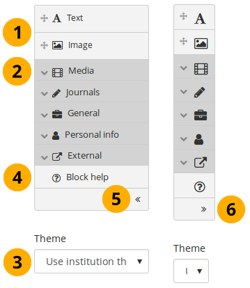
All content items are accessible in the content chooser
-
You can select the Text or the Image block directly as these are two of the more frequently used content items.
You may see additional or different blocks in this list of frequently used content items as it is up to the administrator of the site that you use which blocks to display here. There is an API available to make adding different items easier.
-
You can access all other content items via the individual panels:
- Media: holds blocks for files that can be displayed as links, in folders or in the case of images and videos directly in the page
- Journals: various content blocks which allow you to place journals / journal entries into a page
- General: content items that are of a general nature
- Personal info: choose profile information or your résumé to display in a block
- External: contains blocks to place RSS feeds, external media or GoogleApps documents etc. into a page
The functionality of each block that you can use in your portfolio pages and in group pages is outlined in the section on the individual artefact blocks.
-
Theme: You may be able to choose a theme for your portfolio page. If that is the case, you see the Theme drop-down menu. That allows you to select a theme in which that page is displayed to others who view your portfolio page.
The site administrator must allow page themes in the site’s user settings for this option to be available.
-
Click the Block help icon to be taken to the manual’s block section for the version of Mahara that you are using.
-
Click the arrow pointing to the left to reduce the size of the content chooser. Only the icons will be displayed giving you more space on a page.
-
Click the arrow pointing to the right to show the block descriptions in the content chooser.
The content chooser is displayed per default only with its icons shown on small devices to maximize the screen size that is available to edit a page.
Files, images and video
These artefacts are internal Folioz ones to display:
- links to files that you have uploaded
- folders that contain files
- show images
- embed audio and video files
If you are on a mobile device and select to upload a file, you can take a photo or make a video or audio recording (Android only for audio) directly.
Embedded media
Display an embedded video or audio file from your uploaded files. Mahara comes with the Video.js media player that allows for the display of a number of file formats without having another player installed on the device.
The site administrator must allow media formats. Some of them can be displayed directly within Mahara while others need additional software installed on a device. See the list of allowed media formats.
Videos placed onto a page in this block scale to the width of their column. They also scale automatically when your browser space gets smaller.
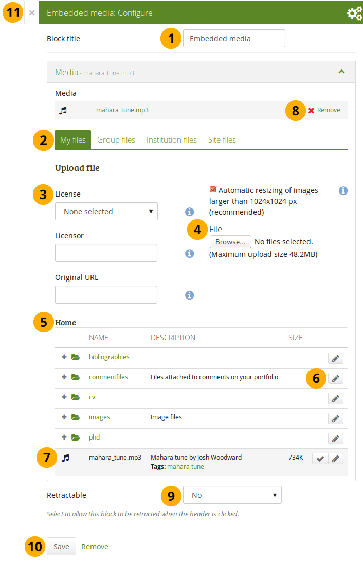
Configure the Embedded media block
-
Block title: Choose a title for your block.
-
Files area: Choose from which files area you would like to select a media file:
- My files: You see all the folders and files that you have created.
- Group files: You see all the folders and files that you are allowed to publish.
- Institution files: If you are an institution administrator, you will see institution folders and files.
- Site files: If you are a site administrator, you will see all site folders and files. Otherwise, you can only see the ones that are in the folder public in the Site files.
-
License information: You see these fields if the site administrator turned on license metadata. Additionally, if you are in an institution, your institution administrator may require you to provide a license.
- License: Your default license is displayed. You can set your default license in your account settings. You may choose a different license for each individual artefact.
- Licensor: If you are uploading a file that somebody else created, you can attribute the work to them here and provide their name for example.
- Original URL: If you are uploading somebody else’s file, provide a link to the original Internet address so that others can go there and view the original file.
-
File: You do not have to go back to your Files area in Create in order to upload a file. You can do so directly from this screen.
-
Folder path: The breadcrumbs show in which folder you are currently.
-
Click the Edit button to change any component of a folder or file, i.e. its name, description and tags. If you have a folder or file included in a page that you submitted for feedback, you will not be able to edit them.
You can still select files that have been submitted in another portfolio page.
-
Click into the row that contains the file you wish to display in the block to select it or click the Select button .
When you place group, institution or site files into a page, beware that these files may not be available at some point anymore when the person in charge deletes them.
-
Click Remove if you want to revert your selection.
-
Retractable: Choose whether you want to allow users to reduce the block to its heading on a page or see just the heading only automatically. The options are:
- No: The block and its content is displayed at all times.
- Yes: Allow users to reduce the block to just the heading by clicking the Retractable icon .
- Automatically retract: Only the heading of the block is visible, and the user can click the Retracted icon to view its content.
-
Click the Save button to accept your changes, or click Cancel to leave the block’s content as it is. Remove is shown only when you place the block into the page for the first time.
-
You can also click the Close button in the top left-hand corner of the modal window to either remove a newly created block before it is being saved or to cancel any changes and leave the block’s content as it is.
Only the files that you are allowed to embed are displayed. If you uploaded a mp4 file but it does not show here, you may have to check if it has the correct codec. Only H.264 mp4 files can be embedded.
iOS devices can even be trickier as these devices may only recognize the MPEG4 “Baseline” profile rather than the “High” profile. You can read the Apple specifications and convert a video if needed using Handbrake. Newer iOS devices (from the iPhone 5S on) should play “High” profile videos.
File(s) to download
Select files that viewers of your portfolio can download.
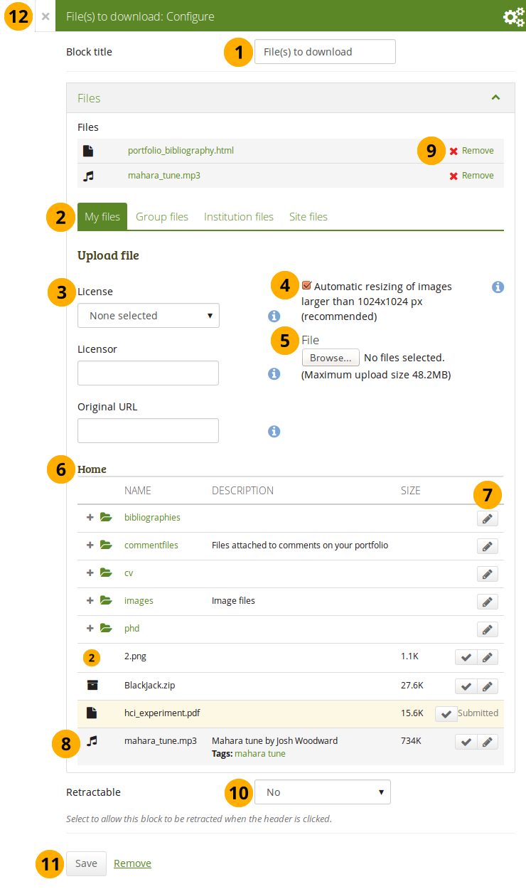
Configure the File(s) to download block
-
Block title: Choose a title for your files block.
-
Files area: Choose from which files area you would like to select a file:
- My files: You see all the folders and files that you have created.
- Group files: You see all the folders and files that you are allowed to publish.
- Institution files: If you are an institution administrator, you will see institution folders and files.
- Site files: If you are a site administrator, you will see all site folders and files. Otherwise, you can only see the ones that are in the folder public in the Site files.
-
License information: You see these fields if the site administrator turned on license metadata. Additionally, if you are in an institution, your institution administrator may require you to provide a license.
- License: Your default license is displayed. You can set your default license in your account settings. You may choose a different license for each individual artefact.
- Licensor: If you are uploading a file that somebody else created, you can attribute the work to them here and provide their name for example.
- Original URL: If you are uploading somebody else’s file, provide a link to the original Internet address so that others can go there and view the original file.
-
If the site administrator turned on the image resizing option, you can decide whether you want to have your images resized if they are larger than the specified dimensions. This option is recommended to save space in your portfolio.
-
File: You do not have to go back to your Files area in Create in order to upload a file. You can do so directly from this screen.
-
Folder path: The breadcrumbs show in which folder you are currently.
-
Click the Edit button to change any component of a folder or file, i.e. its name, description and tags. If you have a folder or file included in a page that you submitted for feedback, you will not be able to edit them.
You can still select files that have been submitted in another portfolio page.
-
Click into the row that contains the file you wish to display in the block to select it or click the Select button .
When you place group, institution or site files into a page, beware that these files may not be available at some point anymore when the person in charge deletes them.
-
Click Remove if you want to revert your selection.
-
Retractable: Choose whether you want to allow users to reduce the block to its heading on a page or see just the heading only automatically. The options are:
- No: The block and its content is displayed at all times.
- Yes: Allow users to reduce the block to just the heading by clicking the Retractable icon .
- Automatically retract: Only the heading of the block is visible, and the user can click the Retracted icon to view its content.
-
Click the Save button to accept your changes, or click Cancel to leave the block’s content as it is. Remove is shown only when you place the block into the page for the first time.
-
You can also click the Close button in the top left-hand corner of the modal window to either remove a newly created block before it is being saved or to cancel any changes and leave the block’s content as it is.
You cannot re-order files once you have selected them. You would need to remove them and select them again in the correct order.
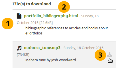
When the block is placed on the portfolio page, you can view more information or download the files.
- file name
- file description
- size
- upload date
- a link to more details
Details about files that can be downloaded.
- View information about the file:
- file name
- file description
- size
- upload date
- Click the file name to be taken to the details page for this file.
- Hover over a file and click anywhere into the row or on the download icon to download the file.
When you click the file name, you are taken to the details page for that particular file and see some more metadata.
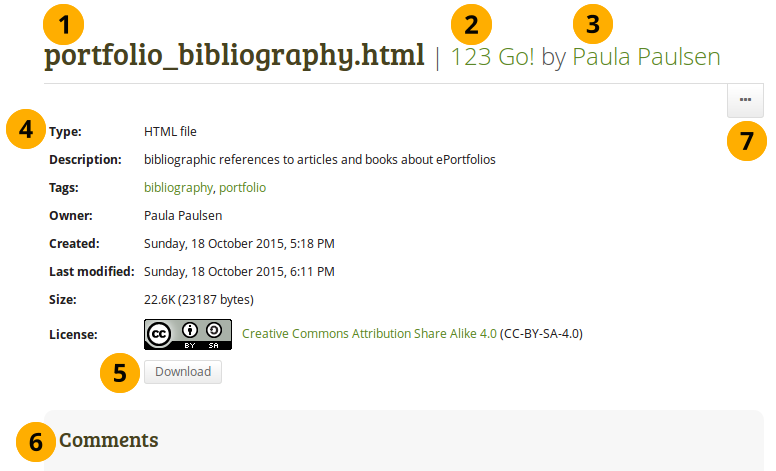
More details about a file that can be downloaded.
- The name of the file is displayed.
- The title of the page in which the artefact appears is linked.
- The author of the page is displayed and a link to the profile page provided.
- Additional metadata is displayed for the file:
- file type
- description
- tags
- owner
- creation date
- last modified date
- size
- license (if license information is turned on by the site administrator)
- Click the Download button to download the file to your computer.
- If the owner of the file allowed comments, you can comment directly on the file.
- Click the More options button to reach lesser used functionality:
- Add the page that contains the file to your watchlist or remove it.
- Report the file as containing objectionable content.
Folder
Select a folder to display all files within it as links on your page.
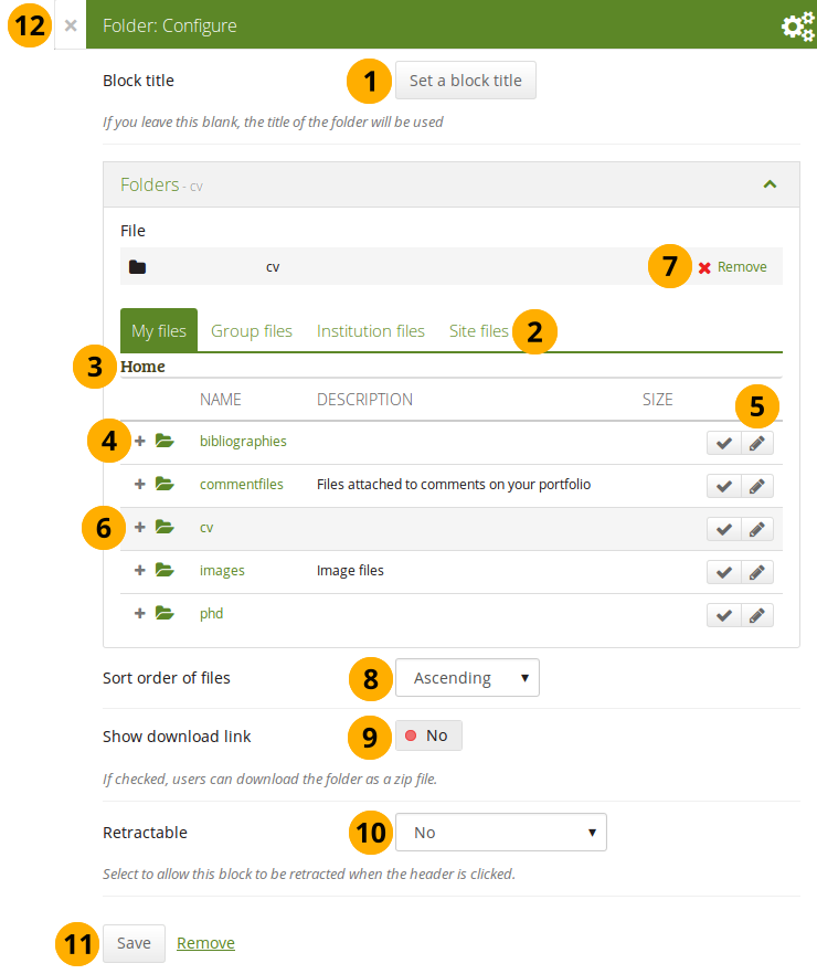
Configure the Folder block
-
Block title: If you do not set a title, the name of the folder that you choose to display will be used.
-
Files area: Choose from which files area you would like to select a folder:
- My files: You see all the folders and files that you have created.
- Group files: You see all the folders and files that you are allowed to publish.
- Institution files: If you are an institution administrator, you will see institution folders and files.
- Site files: If you are a site administrator, you will see all site folders and files. Otherwise, you can only see the ones that are in the folder public in the Site files.
-
Folder path: The breadcrumbs show in which folder you are currently.
-
Click the Expand icon if you want to reach a sub folder.
-
You can edit any component of the folder, i.e. its name, description and tags by clicking the Edit button .
-
Click into the row that contains the folder you wish to display in the block to select it or click the Select button .
You can also still select folders that have been submitted in another portfolio page.
-
Click Remove if you wish to revert your choice.
-
Sort order of files: Decide on the sort order of files in the block when they are displayed on the page. You can choose between:
- Ascending
- Descending
Site administrators decide on the default sort order of content within folder in the Blocktype: File / folder settings.
-
Show download link: Switch this option to “Yes” if you wish to allow the viewers of your page to download the folder contents as zip file.
Site administrators decide in the Blocktype: File / folder settings whether users are allowed to display the download link or not.
-
Retractable: Choose whether you want to allow users to reduce the block to its heading on a page or see just the heading only automatically. The options are:
- No: The block and its content is displayed at all times.
- Yes: Allow users to reduce the block to just the heading by clicking the Retractable icon .
- Automatically retract: Only the heading of the block is visible, and the user can click the Retracted icon to view its content.
-
Click the Save button to accept your changes, or click Cancel to leave the block’s content as it is. Remove is shown only when you place the block into the page for the first time.
-
You can also click the Close button in the top left-hand corner of the modal window to either remove a newly created block before it is being saved or to cancel any changes and leave the block’s content as it is.
When you place a folder with group, institution or site files into a page, beware that these files may not be available at some point anymore when the person in charge deletes them.
You can see information about the folder as well as the files contained within it when the block is placed on a page.
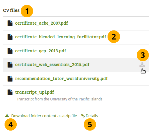
“Folder” block on a page
- Block title.
- Click the file name to be taken to the details page for this file.
- Hover over the file and click anywhere into the row or on the Download icon to download the file.
- Click the Download folder content as zip file to download all files in one go to your computer.
- Click the Details link Details to be taken to the details page for the block.
On the details page for the Folder block you see the following.
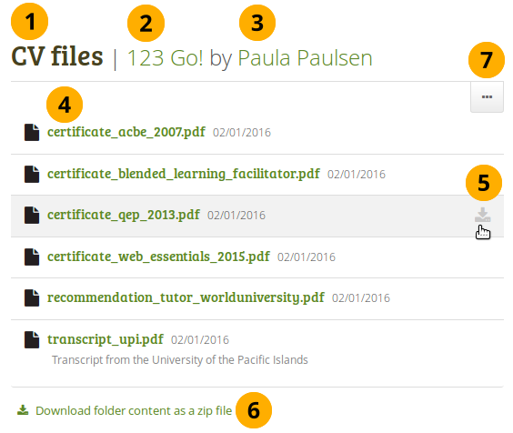
Details page of a “Folder” block
- Block title.
- The title of the page in which the block appears is linked.
- The author of the page is displayed and a link to the profile page provided.
- Click the file name to be taken to the details page for this file.
- Hover over the file and click anywhere into the row or on the Download icon to download the file.
- Click the Download folder content as zip file to download all files in one go to your computer.
- Click the button with the three dots to reach lesser used functionality:
- Add the page that contains the file to your watchlist or remove it.
- Report the file as containing objectionable content.
When you clicked on a file, you are taken to that file’s details page. You always see which folder contains the file.
Details page of a file within a “Folder” block
Image
Display a single image in a block.
In a default Mahara instance, this block is available in the content chooser at the top together with the simple Text block. It does not appear in the section Media as well.
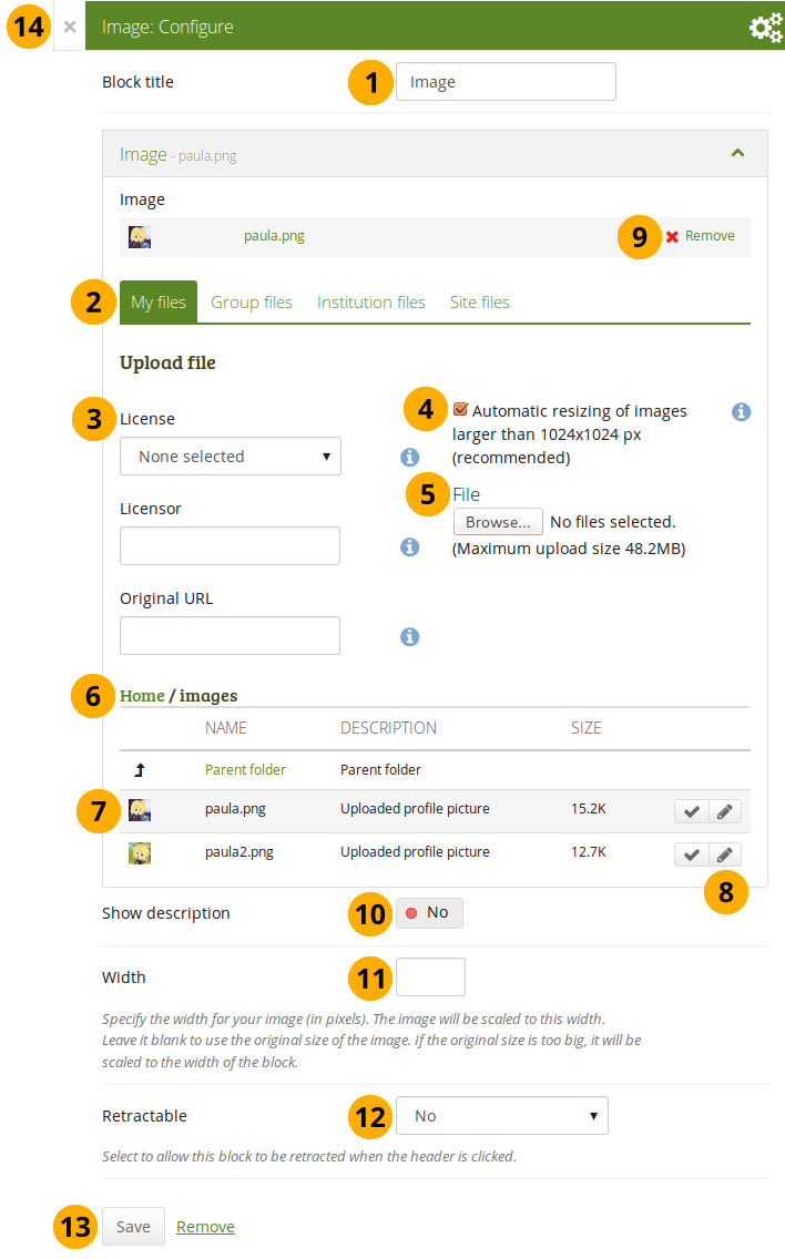
Configure the Image block
-
Block title: Choose a title for your block.
-
Files area: Choose from which files area you would like to select an image:
- My files: You see all the folders and files that you have created.
- Group files: You see all the folders and files that you are allowed to publish.
- Institution files: If you are an institution administrator, you will see institution folders and files.
- Site files: If you are a site administrator, you will see all site folders and files. Otherwise, you can only see the ones that are in the folder public in the Site files.
-
License information: You see these fields if the site administrator turned on license metadata. Additionally, if you are in an institution, your institution administrator may require you to provide a license.
- License: Your default license is displayed. You can set your default license in your account settings. You may choose a different license for each individual artefact.
- Licensor: If you are uploading a file that somebody else created, you can attribute the work to them here and provide their name for example.
- Original URL: If you are uploading somebody else’s file, provide a link to the original Internet address so that others can go there and view the original file.
-
If the site administrator turned on the image resizing option, you can decide whether you want to have your images resized if they are larger than the specified dimensions. This option is recommended to save space in your portfolio.
-
File: You do not have to go back to your Files area in Create in order to upload a file. You can do so directly from this screen.
-
Folder path: The breadcrumbs show in which folder you are currently.
-
Click into the row that contains the file you wish to display in the block to select it or click the Select button . You only see image files that you are allowed to use in the block.
When you place group, institution or site files into a page, beware that these files may not be available at some point anymore when the person in charge deletes them.
-
Click the Edit button to change any component of a folder or file, i.e. its name, description, rotation, and tags. If you have a folder or file included in a page that you submitted for feedback, you will not be able to edit them.
You can still select files that have been submitted in another portfolio page.
If you rotate an image via this dialogue, it will be rotated in all other places where it is used as well.
-
Click Remove if you want to revert your selection.
-
Show description: Set the switch to “Yes” if you wish to display the description of your photo. It could contain the source of it for example.
-
Width: Choose the width (in pixels) for your image. If you do not provide a number, the image will be scaled to the width of the block.
-
Retractable: Choose whether you want to allow users to reduce the block to its heading on a page or see just the heading only automatically. The options are:
- No: The block and its content is displayed at all times.
- Yes: Allow users to reduce the block to just the heading by clicking the Retractable icon .
- Automatically retract: Only the heading of the block is visible, and the user can click the Retracted icon to view its content.
-
Click the Save button to accept your changes, or click Cancel to leave the block’s content as it is. Remove is shown only when you place the block into the page for the first time.
-
You can also click the Close button in the top left-hand corner of the modal window to either remove a newly created block before it is being saved or to cancel any changes and leave the block’s content as it is.
Image gallery
Select a folder with images or individual images to show in a gallery or embed an external image gallery.
Image gallery with uploaded images
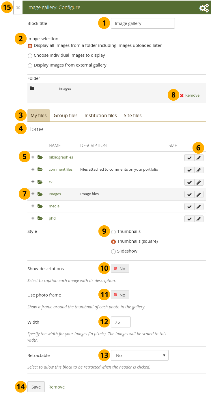
Configure the Image gallery block with internal images
-
Block title: Choose a title for your image gallery block.
-
Image selection: You can choose to display all images from a specific folder or you can select the images individually. See embedding images from an external gallery for that option.
If you choose to display an image gallery based on a folder and you rename images within that folder, they will be reordered accordingly.
-
Files area: Choose from which files area you would like to select an image:
- My files: You see all the folders and files that you have created.
- Group files: You see all the folders and files that you are allowed to publish.
- Institution files: If you are an institution administrator, you will see institution folders and files.
- Site files: If you are a site administrator, you will see all site folders and files. Otherwise, you can only see the ones that are in the folder public in the Site files.
-
Folder path: The breadcrumbs show in which folder you are currently.
-
Click the Expand icon if you want to reach a sub folder.
-
Click the Edit button to change any component of the folder, i.e. its name, description and tags. If you have a folder or file included in a page that you submitted for feedback, you will not be able to edit the file.
-
Click into the row that contains the folder or image you wish to display in the block to select it or click the Select button . You only see image files that are allowed to be used in the block. You can also still select folders or files that have been submitted in another portfolio page.
If you selected to display an entire folder in your image gallery, new images that you upload to that folder are added to your gallery automatically.
-
Click Remove if you want to revert your selection.
-
Style: Decide to show all selected images as thumbnails or as slideshow where you only see one image at a time. If you select the option “Thumbnails (square)”, all your images will be displayed in the same size as thumbnails.
If you select to display your images in a slideshow, you can navigate all images with the help of the icons Next and Previous . Use the icons First and Last to start or end your slideshow.
-
Show descriptions: Turn this option on if you want to display the image descriptions in the gallery.
-
Use photo frame: Using this option will put a frame around each photo.
-
Width: Specify the width (in pixels) for your images. The images are scaled to this width.
-
Retractable: Choose whether you want to allow users to reduce the block to its heading on a page or see just the heading only automatically. The options are:
- No: The block and its content is displayed at all times.
- Yes: Allow users to reduce the block to just the heading by clicking the Retractable icon .
- Automatically retract: Only the heading of the block is visible, and the user can click the Retracted icon to view its content.
-
Click the Save button to accept your changes, or click Cancel to leave the block’s content as it is. Remove is shown only when you place the block into the page for the first time.
-
You can also click the Close button in the top left-hand corner of the modal window to either remove a newly created block before it is being saved or to cancel any changes and leave the block’s content as it is.
When you place group, institution or site files into a page, beware that these files may not be available at some point anymore when the person in charge deletes them.
Image gallery from external images
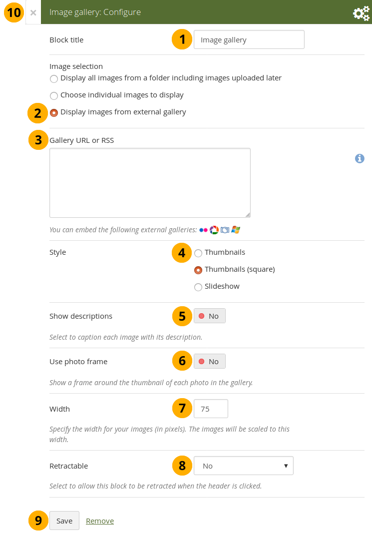
Configure the Image gallery block with external images
-
Block title: Choose a title for your image gallery block.
-
Image selection: Select the option “Display images from external gallery”.
-
Gallery URL or RSS: Copy the link to the external gallery and past it into the text box. You can embed the following external galleries:
- Flickr, e.g. https://www.flickr.com/photos/12345678@N01/sets/98765432123456789/
- Photobucket, e.g. http://s1234.photobucket.com/albums/ee123/username/ or http://s1234.photobucket.com/albums/ee123/username/AlbumName/
- Picasa, e.g. http://picasaweb.google.com/user.name/AlbumName#
- Windows Live Photo Gallery, e.g. http://cid-123456ab7890cd12.photos.live.com/self.aspx/AlbumName/photo.jpg
- To use Flickr, the site administrator has to provide a valid API key.
- To use Photobucket, the site administrator has to provide a valid API key and a secret API key.
- For Windows Live Photo Gallery to work properly, the link to one of the photos inside the album must be copied and pasted into the text box in order to show the entire album.
-
Style: Decide to show all selected images as thumbnails or as slideshow where you only see one image at a time. If you select the option “Thumbnails (square)”, all your images will be displayed in the same size as thumbnails.
-
Show descriptions: Turn this option on if you want to display the image descriptions in the gallery.
-
Use photo frame: Using this option will put a frame around each photo.
-
Width: Specify the width (in pixels) for your images. The images are scaled to this width.
-
Retractable: Choose whether you want to allow users to reduce the block to its heading on a page or see just the heading only automatically. The options are:
- No: The block and its content is displayed at all times.
- Yes: Allow users to reduce the block to just the heading by clicking the Retractable icon .
- Automatically retract: Only the heading of the block is visible, and the user can click the Retracted icon to view its content.
-
Click the Save button to accept your changes, or click Cancel to leave the block’s content as it is. Remove is shown only when you place the block into the page for the first time.
-
You can also click the Close button in the top left-hand corner of the modal window to either remove a newly created block before it is being saved or to cancel any changes and leave the block’s content as it is.
Embed PDFs into a page.
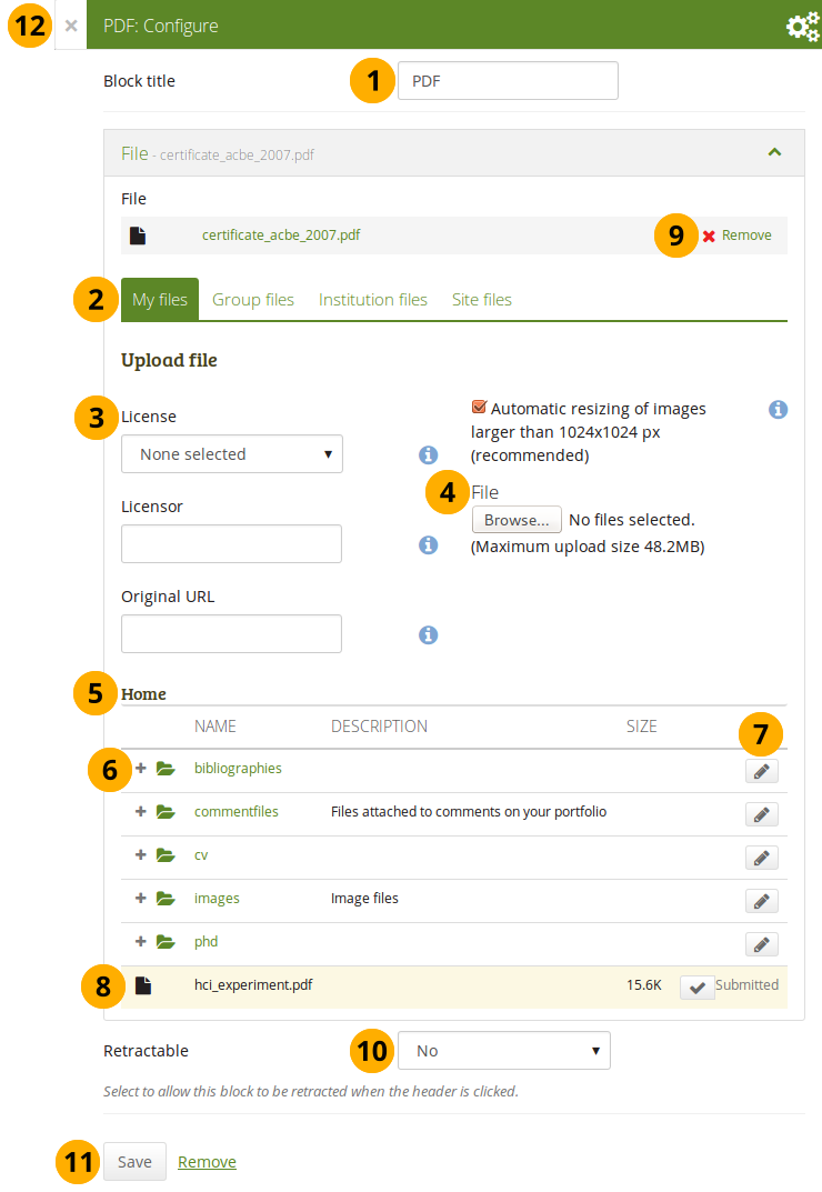
Configure the PDF block
-
Block title: Choose a title for your PDF block.
-
Files area: Choose from which files area you would like to select a file:
- My files: You see all the folders and files that you have created.
- Group files: You see all the folders and files that you are allowed to publish.
- Institution files: If you are an institution administrator, you will see institution folders and files.
- Site files: If you are a site administrator, you will see all site folders and files. Otherwise, you can only see the ones that are in the folder public in the Site files.
-
License information: You see these fields if the site administrator turned on license metadata. Additionally, if you are in an institution, your institution administrator may require you to provide a license.
- License: Your default license is displayed. You can set your default license in your account settings. You may choose a different license for each individual artefact.
- Licensor: If you are uploading a file that somebody else created, you can attribute the work to them here and provide their name for example.
- Original URL: If you are uploading somebody else’s file, provide a link to the original Internet address so that others can go there and view the original file.
-
File: You do not have to go back to your Files area in Create in order to upload a file. You can do so directly from this screen.
-
Folder path: The breadcrumbs show in which folder you are currently.
-
Click the Expand icon if you want to reach a sub folder.
-
Click the Edit button to change any component of a folder or file, i.e. its name, description and tags. If you have a folder or file included in a page that you submitted for feedback, you will not be able to edit them.
You can still select files that have been submitted in another portfolio page.
-
Click into the row that contains the file you wish to display in the block to select it. You only see PDF files.
When you place group, institution or site files into a page, beware that these files may not be available at some point anymore when the person in charge deletes them.
-
Click Remove if you want to revert your selection.
-
Retractable: Choose whether you want to allow users to reduce the block to its heading on a page or see just the heading only automatically. The options are:
- No: The block and its content is displayed at all times.
- Yes: Allow users to reduce the block to just the heading by clicking the Retractable icon .
- Automatically retract: Only the heading of the block is visible, and the user can click the Retracted icon to view its content.
-
Click the Save button to accept your changes, or click Cancel to leave the block’s content as it is. Remove is shown only when you place the block into the page for the first time.
-
You can also click the Close button in the top left-hand corner of the modal window to either remove a newly created block before it is being saved or to cancel any changes and leave the block’s content as it is.
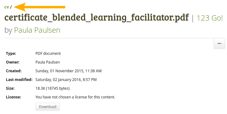
Once the PDF is embedded on a page, you can scroll through it and also download it for example. The PDF is displayed in its best possible fit to show one page completely.
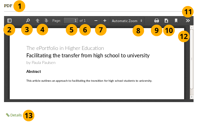
Embedded PDF on a page
- Title of the block.
- Toggle to the sidebar where you can jump from one page to another either in the thumbnail or document outline view.
- Click the Search icon to search within the document.
- You can move to the previous or next page using the Arrow icons.
- The number of the current page is displayed. You can put a different number in and hit the Enter or Tab key and jump to that directly.
- The total number of pages is shown.
- Decrease the page size by clicking the Minus, or increase the page size by clicking the Plus. The block size does not increase.
- Use the Automatic zoom drop-down menu to choose a different zoom size instead of using the Plus and Minus buttons.
- Click the Print icon
 to print the PDF.
 - Click the Download icon
 to download the PDF to your computer. The suggested file name is the one the file has on the site.
 - Click the Tools icon
 to see more options available for this PDF.
 - Use the scrollbar to move through the document.
- Click the Details link Details to be taken to the details page for the block.
If you have trouble embedding a PDF file, you might have come across an issue that others have also experienced. The mimetype of the PDF may not be recognized correctly. The correct “mimetype” is “pdf”, but programmes can circumvent using this mimetype for PDFs to ensure that their file is downloaded instead of viewed in the browser for example. There is not an easy fix to this issue, and the discussion of possible solutions has started.
In the meantime, you can delete the incorrect mimetypes from your browser and ensure that only “PDF” is left.
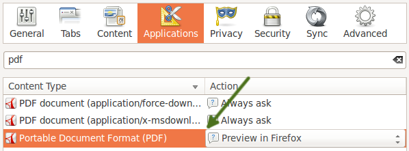
Follow these steps to delete the incorrect mimetypes:
- Close Firefox.
- Locate your profile folder.
- Open the mimeTypes.rdf file in a text editor.
- Search for pdf.
- Leave only the entry that is application/pdf.
- Delete all other PDF references by deleting everything for that entry from
<RDF:Description ...> to </RDF:Description>. - Open Firefox and go to Preferences → Applications.
- Search for pdf. You should now only see one entry that reads “Portable Document Format (PDF)”.
Some HTML
Display the content of an HTML file in a page.
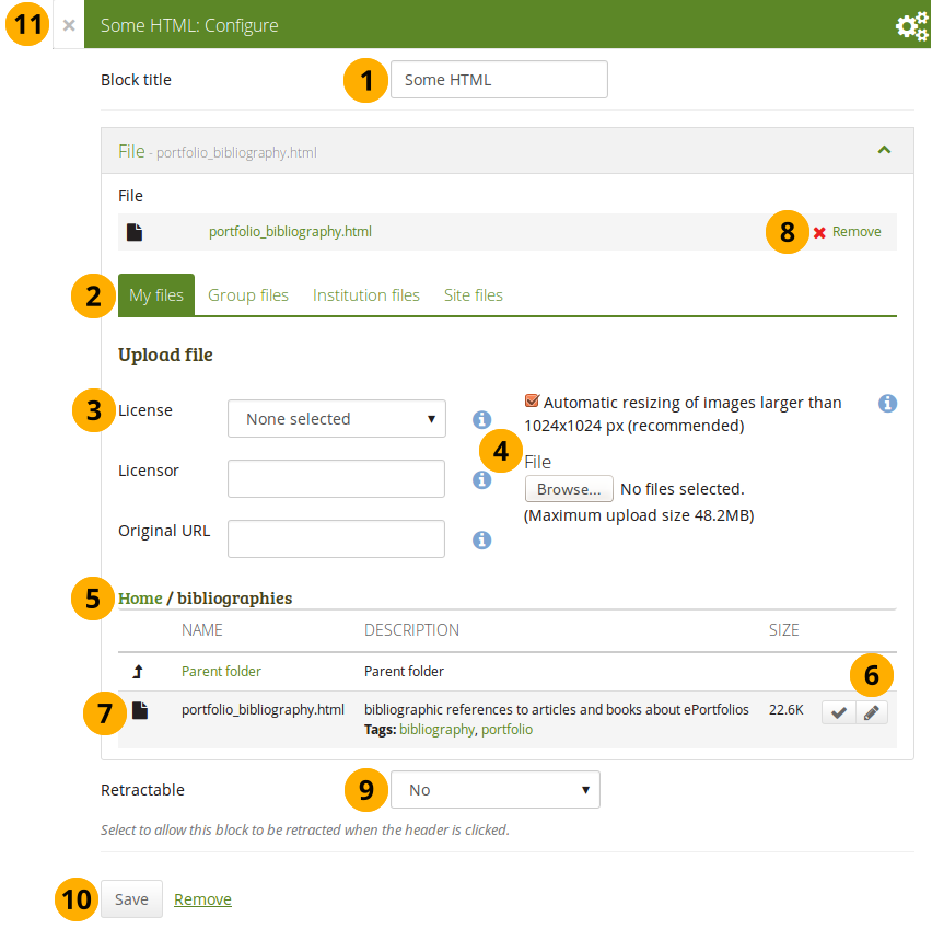
Configure the HTML block
-
Block title: Choose a title for your block.
-
Files area: Choose from which files area you would like to select an HTML file:
- My files: You see all the folders and files that you have created.
- Group files: You see all the folders and files that you are allowed to publish.
- Institution files: If you are an institution administrator, you will see institution folders and files.
- Site files: If you are a site administrator, you will see all site folders and files. Otherwise, you can only see the ones that are in the folder public in the Site files.
-
License information: You see these fields if the site administrator turned on license metadata. Additionally, if you are in an institution, your institution administrator may require you to provide a license.
- License: Your default license is displayed. You can set your default license in your account settings. You may choose a different license for each individual artefact.
- Licensor: If you are uploading a file that somebody else created, you can attribute the work to them here and provide their name for example.
- Original URL: If you are uploading somebody else’s file, provide a link to the original Internet address so that others can go there and view the original file.
-
Upload file: You do not have to go back to your Files area in Create in order to upload a file. You can do so directly from this screen.
-
Folder path: The breadcrumbs show in which folder you are currently.
-
Click the Edit button to change any component of a folder or file, i.e. its name, description and tags. If you have a folder or file included in a page that you submitted for feedback, you will not be able to edit them.
You can still select files that have been submitted in another portfolio page.
-
Click into the row that contains the file you wish to display in the block to select it or click the Select button . You only see HTML files.
When you place group, institution or site files into a page, beware that these files may not be available at some point anymore when the person in charge deletes them.
-
Click Remove if you want to revert your selection.
-
Retractable: Choose whether you want to allow users to reduce the block to its heading on a page or see just the heading only automatically. The options are:
- No: The block and its content is displayed at all times.
- Yes: Allow users to reduce the block to just the heading by clicking the Retractable icon .
- Automatically retract: Only the heading of the block is visible, and the user can click the Retracted icon to view its content.
-
Click the Save button to accept your changes, or click Cancel to leave the block’s content as it is. Remove is shown only when you place the block into the page for the first time.
-
You can also click the Close button in the top left-hand corner of the modal window to either remove a newly created block before it is being saved or to cancel any changes and leave the block’s content as it is.
You can only display a self-contained HTML file in a page, but not an entire site because the links to the files are not retained correctly when you upload files.
Journals
You can embed content from your journals in various ways in a page:
- display an entire journal
- display only one journal entry
- show the latest journal entries
- display journal entries with a specific tag
You must create at least one journal in order to see anything in this block.
You can allow the copying of your journal (entries). Choose this option wisely because once a user copied your journal content into their portfolio, it looks as if they had written the journal entries. This could lead to plagiarism. However, it can be used very nicely to create templates and to scaffold learning.
Journals exist in all areas of Mahara:
- Personal portfolio
- Groups
- Institution level
- Site level
You can display journals or journal entries in these different contexts the following way:
- Personal journals: You can include personal journals and journal entries in your own portfolios and in group portfolios. If somebody else changes the block configuration in a group portfolio, they will not be able to choose your journals or journal entries though. Only you can place them there.
- Group journals: You can display group journals and entries only in the group in which they were created.
- Institution journals: An institution’s journals are only available for inclusion in pages for that institution.
- Site journals: You can add site journals only to site portfolios.
Journal
Display an entire journal on your portfolio page.
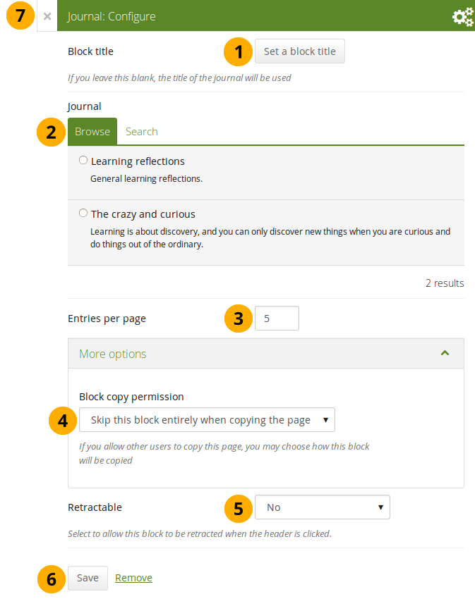
Configure the Journal block
-
Block title: The title for the block is chosen automatically from the title of the journal unless you provide a different one.
-
Journal: Select the journal you wish to display. If you have many journals, you can also search for the one you want to use.
The search is performed in the title, description, and tags.
-
Entries per page: Decide how many entries you want to display. Entries beyond this number are accessible via a navigation bar.
-
Block copy permissions: You decide what shall happen with this block when you allow other users to copy your page. The options are:
- Skip this block entirely when copying the page
- Others may display your journal in their page
- Others will get their own copy of your journal
-
Retractable: Choose whether you want to allow users to reduce the block to its heading on a page or see just the heading only automatically. The options are:
- No: The block and its content is displayed at all times.
- Yes: Allow users to reduce the block to just the heading by clicking the Retractable icon .
- Automatically retract: Only the heading of the block is visible, and the user can click the Retracted icon to view its content.
-
Click the Save button to accept your changes, or click Cancel to leave the block’s content as it is. Remove is shown only when you place the block into the page for the first time.
-
You can also click the Close button in the top left-hand corner of the modal window to either remove a newly created block before it is being saved or to cancel any changes and leave the block’s content as it is.
Once you have included the Journal block into a page, you can create a new journal entry directly from that block when you are in the Edit mode for the page. When you click the New entry button, you will be taken to your journal and a new entry is started for you. It is then added to the journal automatically.
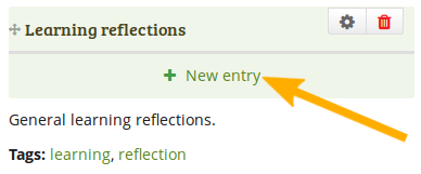
Create a new journal entry directly from the Entire journal block
Journal entry
Display one journal entry on your portfolio page.
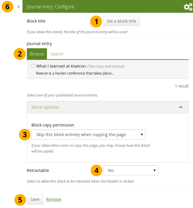
Configure the Journal entry block
-
Block title: The title of the journal entry is chosen automatically unless you provide a different one.
-
Journal entry: Select the journal entry you wish to display. If you have many, you can also search for the one you want to use. You always also see the title of the journal in which the entry appears.
The search is performed in the title, description, and tags.
-
Block copy permissions: You decide what shall happen with this block when you allow other users to copy your page. Options are:
- Skip this block entirely when copying the page
- Others may display your journal entry in their page
- Others will get their own copy of your journal entry
-
Retractable: Choose whether you want to allow users to reduce the block to its heading on a page or see just the heading only automatically. The options are:
- No: The block and its content is displayed at all times.
- Yes: Allow users to reduce the block to just the heading by clicking the Retractable icon .
- Automatically retract: Only the heading of the block is visible, and the user can click the Retracted icon to view its content.
-
Click the Save button to accept your changes, or click Cancel to leave the block’s content as it is. Remove is shown only when you place the block into the page for the first time.
-
You can also click the Close button in the top left-hand corner of the modal window to either remove a newly created block before it is being saved or to cancel any changes and leave the block’s content as it is.
Recent journal entries
Display recent journal entries across all your journals on your portfolio page. You can use this block also in group, institution and site pages.
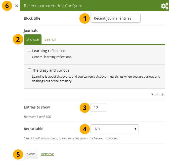
Configure the Recent journal entries block
-
Block title: Choose a title for your block.
-
Journals: Select the journal(s) from which you wish to display the latest entries. If you have many journals, you can also search for the one(s) you want to use.
The search is performed in the title, description, and tags.
-
Entries to show: Decide how many entries you want to display.
-
Retractable: Choose whether you want to allow users to reduce the block to its heading on a page or see just the heading only automatically. The options are:
- No: The block and its content is displayed at all times.
- Yes: Allow users to reduce the block to just the heading by clicking the Retractable icon .
- Automatically retract: Only the heading of the block is visible, and the user can click the Retracted icon to view its content.
-
Click the Save button to accept your changes, or click Cancel to leave the block’s content as it is. Remove is shown only when you place the block into the page for the first time.
-
You can also click the Close button in the top left-hand corner of the modal window to either remove a newly created block before it is being saved or to cancel any changes and leave the block’s content as it is.
If you have multiple journals, you can display recent entries from all of them.
Once you included the Recent journal entries block into a page, you can create a new journal entry directly from that block when you are in Edit mode for the page. When you click the New entry button, you will be taken to your journal, and a new entry is started for you. It is then added to the journal automatically.
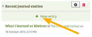
Create a new journal entry directly from the Recent journal entries block - one journal only
If you enabled multiple journals and selected more than one for which to display recent journal entries, you will see a slightly different display.
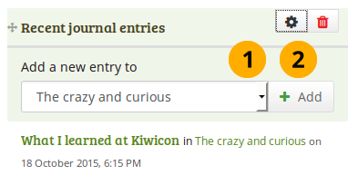
Create a new journal entry directly from the Recent journal entries block - multiple journals available
- Choose the journal to which to add your entry from the drop-down menu.
- Click the Add button to create your new entry.
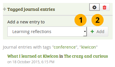
Tagged journal entries
Display tagged journal entries across all your journals on your portfolio page.
Configure the Tagged journal entries block
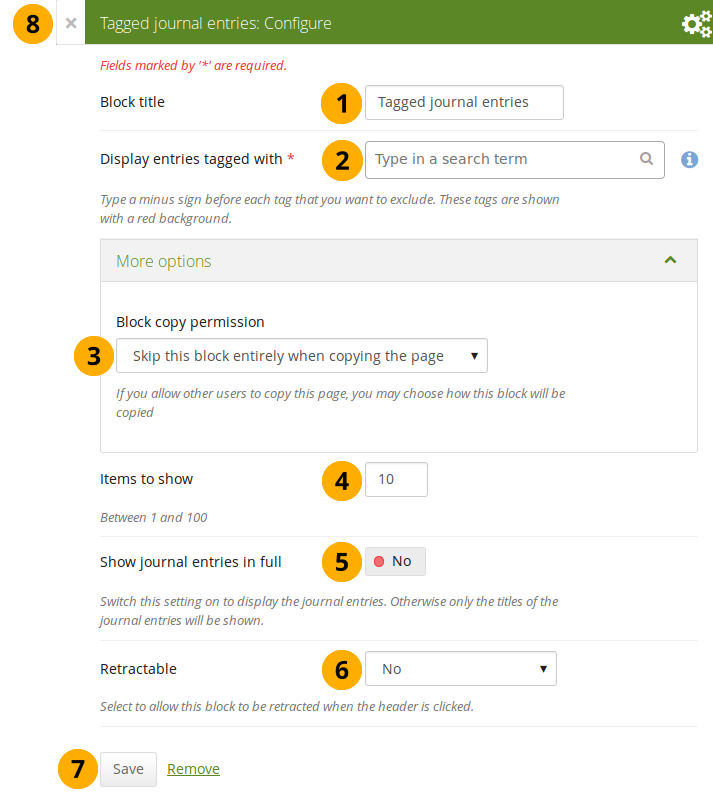
- Block title: Choose a title for your block.
- Display entries tagged with: Choose the tags that you want to use to filter all your journal entries for display. Only tags you used on journal entries are available. You can include or exclude tags. See below for more information.
-
Block copy permissions: You decide what shall happen with this block when you allow other users to copy your page. Options are:
- Skip this block entirely when copying the page
- Others will get a copy of the block configuration: The block is copied, but not the journal entries. When the user creates journal entries with the tag(s) used in the block, they will be displayed.
- Items to show: Decide how many entries you want to display.
- Show journal entries in full: If you switch this option to “Yes”, your journal entries will be displayed. Otherwise, only their titles are shown and people need to click on them to read your entries.
-
Retractable: Choose whether you want to allow users to reduce the block to its heading on a page or see just the heading only automatically. The options are:
- No: The block and its content is displayed at all times.
- Yes: Allow users to reduce the block to just the heading by clicking the Retractable icon .
- Automatically retract: Only the heading of the block is visible, and the user can click the Retracted icon to view its content.
- Click the Save button to accept your changes, or click Cancel to leave the block’s content as it is. Remove is shown only when you place the block into the page for the first time.
- You can also click the Close button in the top left-hand corner of the modal window to either remove a newly created block before it is being saved or to cancel any changes and leave the block’s content as it is.
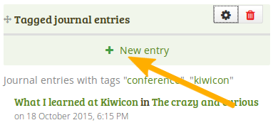
Add new tagged journal entries directly from a page
Once you have included the Tagged journal entries block into a page, you can create a new journal entry directly from that block when you are in Edit mode for the page. When you click the New entry button, you will be taken to your journal and a new entry is started for you. It is then added to the journal automatically with the tag(s) whose journal entries are displayed on the page.
Create a new journal entry directly from the Tagged journal entries block - one journal only
If you enabled multiple journals and have a minimum of two journals, you will see a slightly different display.
Create a new journal entry directly from the Tagged journal entries block - multiple journals available
- Choose the journal to which to add your entry from the drop-down menu.
- Click the Go button to create your new entry.
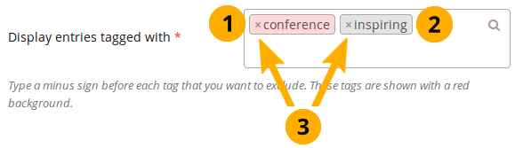
Select tags to include or exclude
When you want to choose which tags to use in your block, you can select multiple tags to include or exclude. That way you can be very flexible in which entries to display in your block and which ones to leave out. You must have tagged your journal entries beforehand. If you haven’t done that, please go to your journal entries and tag them. You can find them under Main menu → Create → Journals.
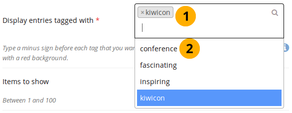
Display all the tags that you used on journal entries
- Click in the text field for the tag entries. You can start typing the tag that you are looking for if you know it. The result list that you see underneath gets shorter based on what you type. If you want to exclude a tag, type the minus sign and then the tag.
- In the tag result list, click the tag that you want to include. If you want to exclude a tag, type the minus sign and then select the tag.
A selection of tags for the tagged journal entries
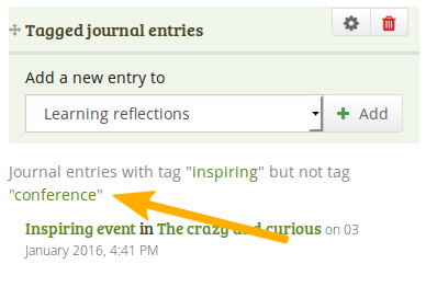
When you display your page that has a tagged journal entries block, you see which tags are used to filter your journal entries. For example: Journal entries with tag “learning” but not tag “conference”.
Know which tags to include and exclude
You can add multiple tags to limit the results as well as indicate which tags you want to ignore. If you select multiple tags, a journal entry must match all selected tags in order to be listed.
Let’s assume, you tagged your journal entries with the following tags:
- learning, formal, education
- learning, formal, education, music
- learning, formal, education, language
- learning, nonformal, education
- learning, nonformal, education, music
- learning, nonformal, education, language
- teaching, nonformal, education
- teaching, nonformal, education, music
- teaching, nonformal, education, language
When you select:
- the tag “education”, all journal entries would be displayed in the block.
- the tags “learning” and “language”, journal entries 3 and 6 would be displayed, i.e. the entries that are tagged “learning” and “language”.
- the tags “education” and “language”, journal entries 3, 6, and 9 would be shown, i.e. the entries that are tagged “education” and “language”.
You can also exclude tags from the results by putting a minus sign before the tag you want to select.
If you select:
- the tag “learning” and exclude “formal” (exclude the tag by typing “-formal” without the quotation marks), journal entries 4, 5, and 6 would be displayed. You search for journal entries tagged “learning” and not “formal”.
- the tag “nonformal” and “education” and exclude “music” and “language” (exclude the tags by typing “-music -language” without the quotation marks), journal entries 4 and 7 would be shown. You search for journal entries tagged “nonformal” and “education” and not “music” and not “language”.
The operators and and not are two of the so-called “Boolean operators”.
General
The artefacts in this tab are of a general nature or do not fit into any other category and can be used around the site.
When you create a page in a group, you do not have the plans block available as you cannot create plans in groups. Additionally, you can choose the following blocks when you edit the group homepage:
- Group info
- Group members
- Group pages
Annotation
Add a block to your page which lets you add an annotation for your page.
This feature is used in conjunction with SmartEvidence.
Write an annotation
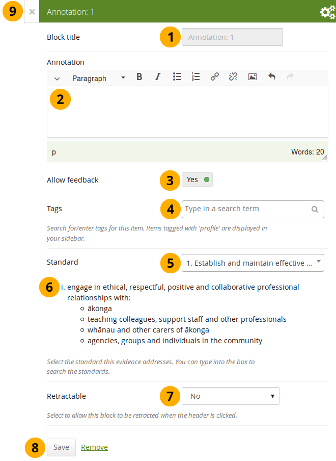
Configure the Annotation block
-
Block title: The block title is set automatically based on the standard selected. It takes the form of “Annotation: Shortname of the standard” and cannot be changed.
-
Annotation: Write your annotation for your portfolio page. The annotation helps connect the evidence on the page to the standard or competency you selected to associate it with in the competency framework.
You can change the text as long as no feedback has been placed on the block. In order to change the text, you go into Edit mode of the page and then choose the Configure icon of the Annotation block that you want to change. You cannot change the annotation from the SmartEvidence map.
-
Allow feedback: When you allow feedback on your annotation, others can leave feedback as usual. However, as soon as the first feedback has been added, you will not be able to make changes to your annotation text anymore. That is to ensure that the feedback still relates back to the annotation.
-
Tags: Enter tags to find your annotation more easily at a later stage. Separate your tags with commas. If you already have tags, you can click on the link Show my tags and select the ones that you think will fit for this collection as well. They will be entered into the text field for you.
-
Standard: When you place the Annotation block on the page, you can select the standard with which the page shall be associated based on the SmartEvidence framework selected for the collection. You can change the standard until somebody leaves feedback or makes an assessment. If you select the page from the SmartEvidence overview page, the standard is pre-selected and cannot be changed.
You can use the Annotation block without SmartEvidence, but then you can’t choose a competency standard.
-
The description of the selected standard is displayed so you can easily reference it.
-
Retractable: Choose whether you want to allow users to reduce the block to its heading on a page or see just the heading only automatically. The options are:
- No: The block and its content is displayed at all times.
- Yes: Allow users to reduce the block to just the heading by clicking the Retractable icon .
- Automatically retract: Only the heading of the block is visible, and the user can click the Retracted icon to view its content.
-
Click the Save button to accept your changes, or click Cancel to leave the block’s content as it is. Remove is shown only when you place the block into the page for the first time.
-
You can also click the Close button in the top left-hand corner of the modal window to either remove a newly created block before it is being saved or to cancel any changes and leave the block’s content as it is.
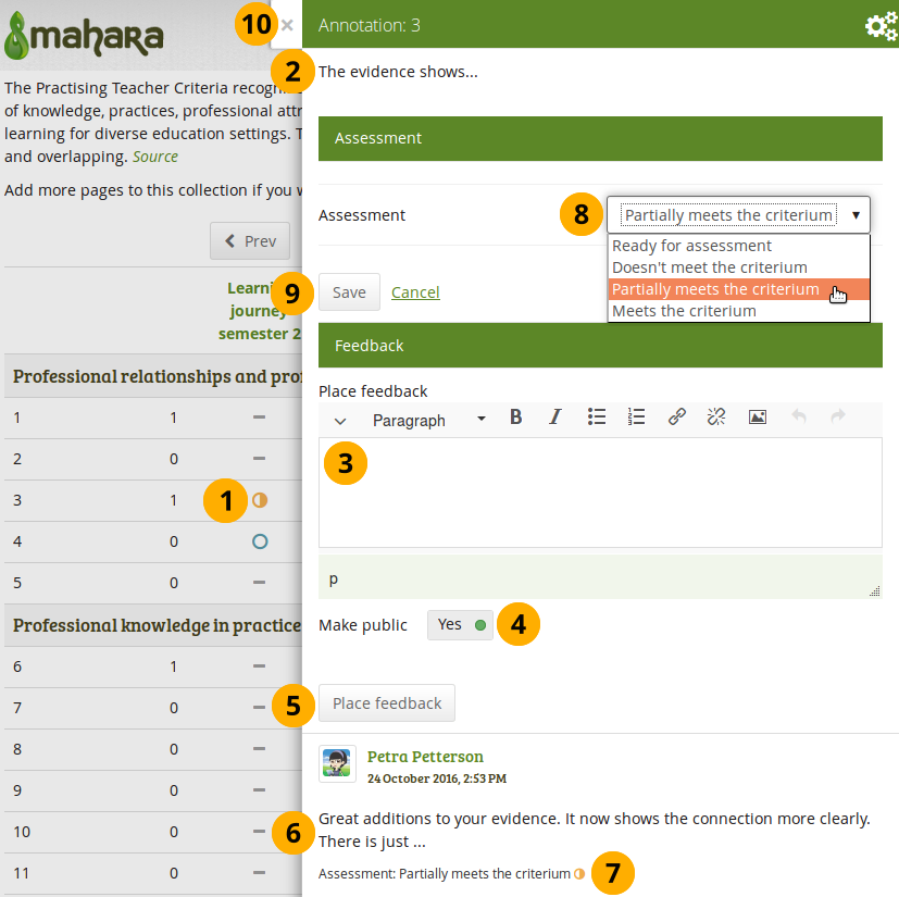
Respond to an annotation on the SmartEvidence map
When you have access to a collection that contains a SmartEvidence map, you can leave feedback on an annotation. You may be able to assess it if you have staff or institution administrator permissions in the same institution as the portfolio author unless it is a self-assessment framework.
Respond to an annotation
-
Click the annotation on the SmartEvidence map that you wish to take a closer look at. A modal window opens with the annotation.
-
Read the annotation.
-
Place feedback: You can leave feedback on the annotation.
-
Make public: Decide whether everybody who has access to the page can view your feedback or just the portfolio author.
-
Click the Place feedback button to add your feedback to the annotation.
-
You can view the feedback of others.
-
If an assessment was already made, you can see it here. This also serves as log of the assessment changes throughout the lifetime of the annotation.
-
Assessment: If you have the permission to assess the standard, you see a drop-down menu here with the possible statuses that you can use. Select one of them.
The assessment statuses are defined in the SmartEvidence framework file.
-
Click the Save button to keep your selection or click Cancel to abort the assessment.
-
You can also click the Close button in the top left-hand corner of the modal window to either remove a newly created block before it is being saved or to cancel any changes and leave the block’s content as it is.
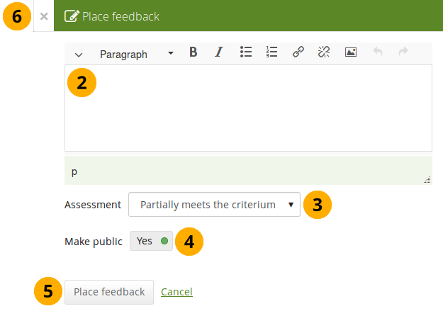
Respond to an annotation on a page
You can provide feedback to an annotation, and assess it if you have the appropriate permission, also from the portfolio page on which the annotation is placed.
Respond to an annotation on a page
-
Click the Place feedback link at the bottom of the Annotation block.
-
Write your feedback.
-
Assessment: If you have the permission to assess the standard, you see a drop-down menu with the possible statuses that you can use. Select one of them.
The assessment statuses are defined in the SmartEvidence framework file.
-
Make public: Decide whether everybody who has access to the page can view your feedback or just the portfolio author.
-
Click the Place feedback button to add your feedback to the annotation or click Cancel to abort the assessment.
-
You can also click the Close button in the top left-hand corner of the modal window to either remove a newly created block before it is being saved or to cancel any changes and leave the block’s content as it is.
Delete an annotation
When you delete an annotation, all its feedback is deleted as well. You cannot retrieve it again easily.
Comments
You can move the comments section from the bottom of a page elsewhere onto your page to integrate it better with your page content. Please note the following:
- There is no configuration possible for this block.
- You only see comments when you display a page, but not in edit mode.
- You can only place 1 comment block onto a page.
- Comments for individual artefacts is still placed at the bottom of the artefact details pages because you cannot put a block onto these pages.
- You can move the block like any other block on your page. If you delete the block, the comments are displayed at the bottom of the page again.
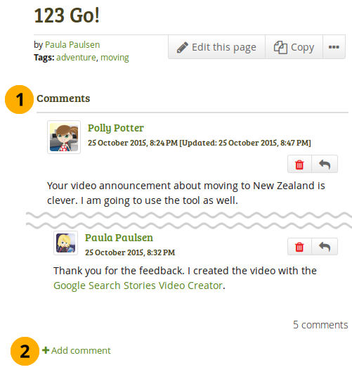
What the feedback block looks like on a page
- The block has the heading “Comments” unless your Mahara installation uses a different word.
- When you click the Add comment link, a modal window is displayed in which you can enter your comments with all the usual functionality.
Creative Commons license
Add a block to your page which lets users know under which Creative Commons license your page is published.
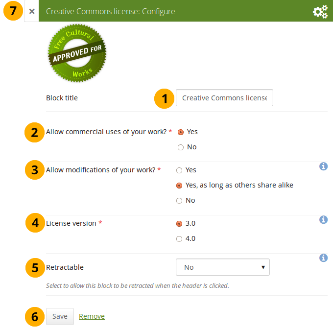
Configure the Creative Commons license block
-
Block title: Choose a title for your block.
-
Allow commercial uses of your work? Decide whether users can re-use your work for commercial purposes.
-
Allow modifications of your work? Decide whether others can remix your work and create something new and if so under which conditions.
-
License version: Select under which Creative Commons license you wish to publish your work. You can choose between
- Creative Commons 3.0
- Creative Commons 4.0
Check out what is new in Creative Commons 4.0, and why you may want to choose that license.
-
Retractable: Choose whether you want to allow users to reduce the block to its heading on a page or see just the heading only automatically. The options are:
- No: The block and its content is displayed at all times.
- Yes: Allow users to reduce the block to just the heading by clicking the Retractable icon .
- Automatically retract: Only the heading of the block is visible, and the user can click the Retracted icon to view its content.
-
Click the Save button to accept your changes, or click Cancel to leave the block’s content as it is. Remove is shown only when you place the block into the page for the first time.
-
You can also click the Close button in the top left-hand corner of the modal window to either remove a newly created block before it is being saved or to cancel any changes and leave the block’s content as it is.
Group info
This block is a default block on the group homepage. There is no configuration possible.
This block can only be used on a group homepage.
Items in the group info block
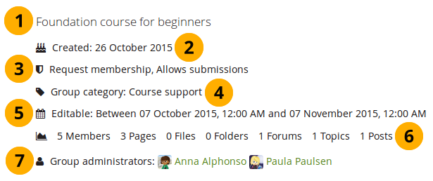
The block contains information about:
- Description of the group
- Group creation date
- Type of group
- Group category if any was chosen
- Dates between which regular group members can participate in group activities. This information is only visible if any dates were entered in the group settings.
- Group statistics
- number of group members
- number of pages created in the group
- number of files uploaded to the group
- number of folders created in the group
- number of forums created in the group
- number of forum topics created in the group
- number of posts in forum topics in the group
- Group administrators
Group members
This block is a default block on the group homepage. You can display member profile pictures and their names.
This block can only be used on a group homepage.
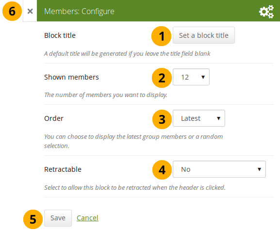
Configure the Group members block
- Block title: The automatic title for this block is “Members”. You can set another one if you wish.
- Shown members: Choose how many members (between 1 and 100) are shown on the group homepage. All others are accessible via the Members tab in the group. The default number of members displayed is 12.
- Order: Choose the order in which members are displayed. Options are
- Latest: Display members according to their group joining date in reverse chronological order.
- Random: Let Mahara decide which members to display.
- Retractable: Choose whether you want to allow users to reduce the block to its heading on a page or see just the heading only automatically. The options are:
- No: The block and its content is displayed at all times.
- Yes: Allow users to reduce the block to just the heading by clicking the Retractable icon .
- Automatically retract: Only the heading of the block is visible, and the user can click the Retracted icon to view its content.
- Click the Save button to accept your changes, or click Cancel to leave the block’s content as it is. Remove is shown only when you place the block into the page for the first time.
- You can also click the Close button in the top left-hand corner of the modal window to either remove a newly created block before it is being saved or to cancel any changes and leave the block’s content as it is.
Group portfolios
This block is a default block on the group homepage. You can display pages and collections created in and / or shared with the group in this block.
This block can only be used on a group homepage.
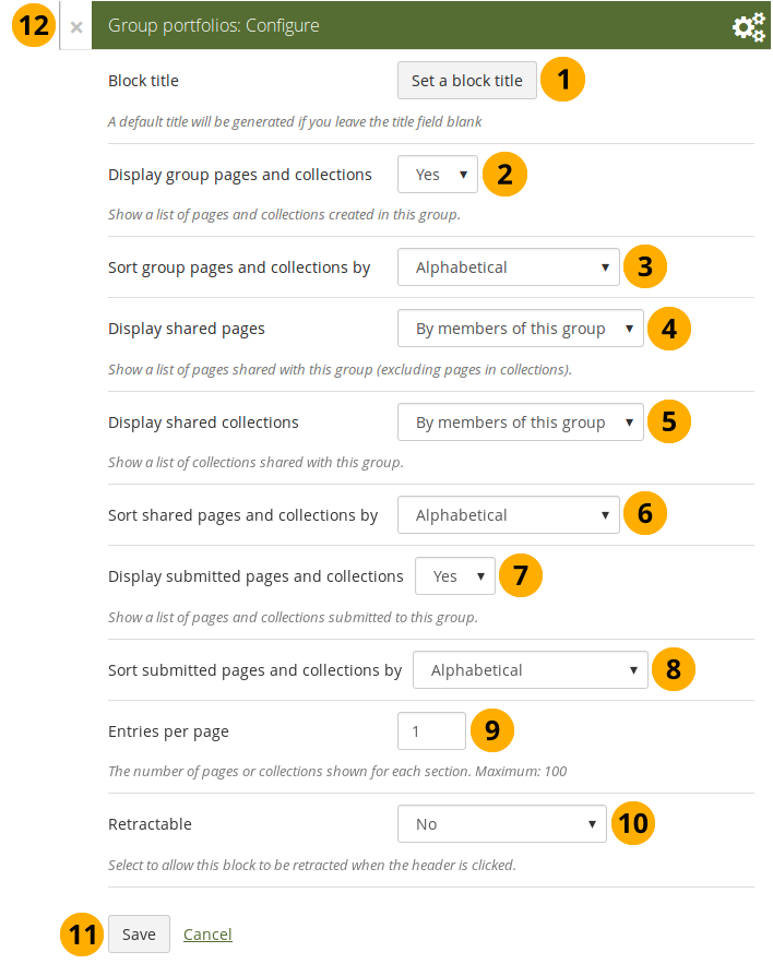
Configure the Group portfolios block
-
Block title: The automatic title for this block is “Group portfolios”. You can set another one if you wish.
-
Display group pages and collections: Decide whether to display pages and collections that were created in the group. “Yes” is the default option.
-
Sort group pages and collections by: Choose in which order to display portfolios created in the group. “Alphabetical” is the default option, but you can also display them based on when they were last updated.
-
Display shared pages: Decide whether to display pages that users shared with the group. Pages that are in collections are not displayed. The options are:
-
None: No shared pages are displayed.
-
By members of this group: Display only pages that have been shared by members of the group.
This option is particularly well-suited for groups that are used for class purposes. That way, students can share their pages or collections with the group for a long time, but the administrator can choose to display only pages of group members but not those that are not members anymore. The pages of non-group members are still accessible via the Shared with me functionality.
-
By anybody: Display all pages that have been shared with the group.
-
-
Display shared collections: Decide whether to display collections that users shared with the group. The options are:
- None: No shared collections are displayed.
- By members of this group: Display only collections that have been shared by members of the group.
- By anybody: Display all collections that have been shared with the group.
Submitted pages are not displayed in the section of “Shared pages” and “Shared collections” to avoid confusion whether they have been shared with the group or not.
-
Sort shared pages and collections by: Choose in which order to display pages and collections shared with the group. “Alphabetical” is the default option, but you can also display them based on when they were last updated.
-
Display submitted pages and collections: Decide whether to display pages and collections that group members submitted to the group. There is no distinction made between pages and collections. “Yes” is the default option.
When you choose this option, you also see which members have not yet submitted a portfolio to the group. This is helpful in particular in large groups with lots of portfolio submissions.
-
Sort submitted pages and collections by: Choose in which order to display pages and collections submitted to the group. “Alphabetical” is the default option, but you can also display them based on when they were last updated.
-
Entries per page: Choose the maximum number of pages or collections you wish to see on the group homepage for the above before a paginator is displayed. You can display a maximum of 100 items per category.
-
Retractable: Choose whether you want to allow users to reduce the block to its heading on a page or see just the heading only automatically. The options are:
- No: The block and its content is displayed at all times.
- Yes: Allow users to reduce the block to just the heading by clicking the Retractable icon .
- Automatically retract: Only the heading of the block is visible, and the user can click the Retracted icon to view its content.
-
Click the Save button to accept your changes, or click Cancel to leave the block’s content as it is. Remove is shown only when you place the block into the page for the first time.
-
You can also click the Close button in the top left-hand corner of the modal window to either remove a newly created block before it is being saved or to cancel any changes and leave the block’s content as it is.
A page is considered as modified when the content of at least one block is updated, including the adding of a new Mahara journal entry into the journal block.
Inbox
The Inbox block displays the latest messages that you have received.
This block can only be used on your dashboard.
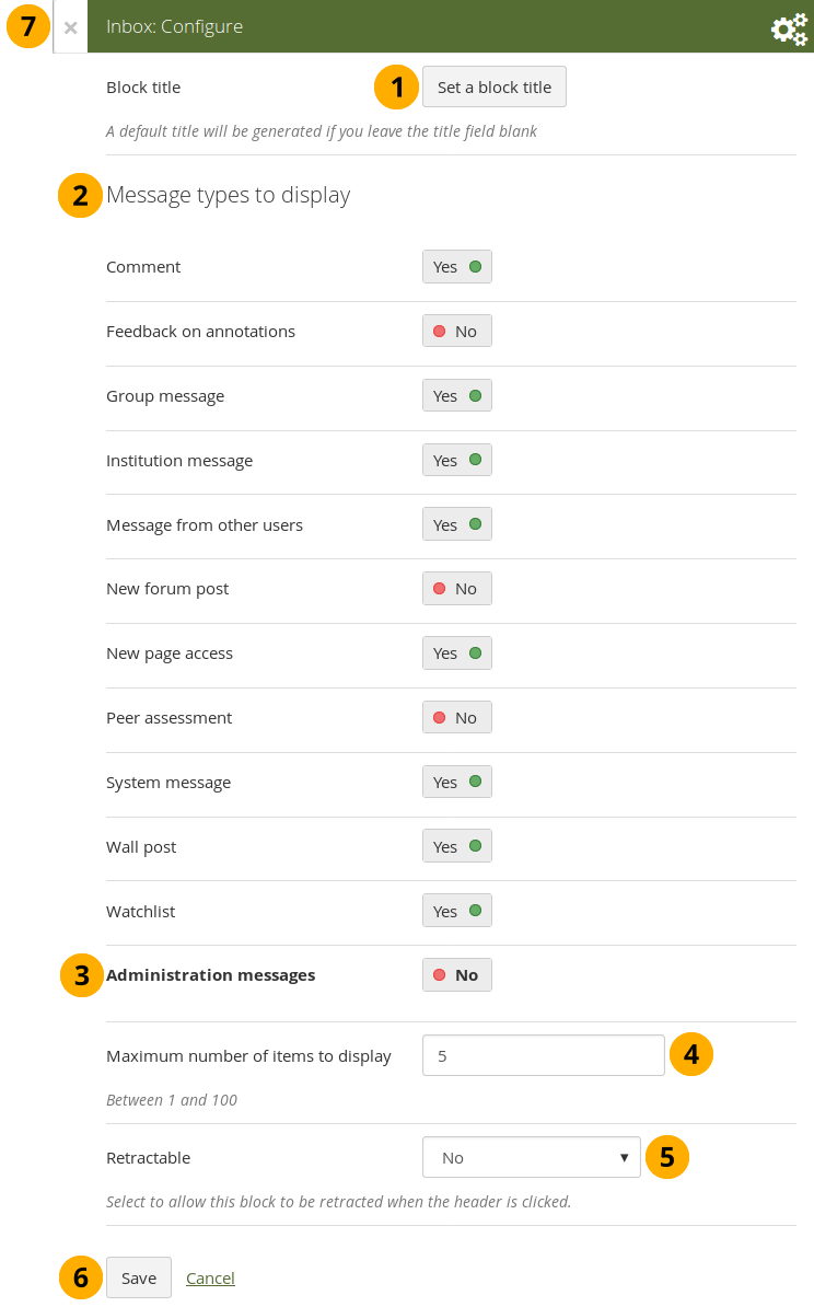
Configure the Inbox block
- Block title: The automatic title for this block is “Inbox”. You can set another one if you wish.
- Message types to display: Change the switch to “Yes” for each message type that you want to display in this block.
- Administration messages: If you are an institution or site administrator, you see this option. All administration messages such as for objectionable content, virus upload, contact, etc. are grouped in “Administration messages”.
- Maximum number of items to display: Decide how many messages shall be shown on your dashboard. You can choose between 1 and 100.
- Retractable: Choose whether you want to allow users to reduce the block to its heading on a page or see just the heading only automatically. The options are:
- No: The block and its content is displayed at all times.
- Yes: Allow users to reduce the block to just the heading by clicking the Retractable icon .
- Automatically retract: Only the heading of the block is visible, and the user can click the Retracted icon to view its content.
- Click the Save button to accept your changes, or click Cancel to leave the block’s content as it is. Remove is shown only when you place the block into the page for the first time.
- You can also click the Close button in the top left-hand corner of the modal window to either remove a newly created block before it is being saved or to cancel any changes and leave the block’s content as it is.
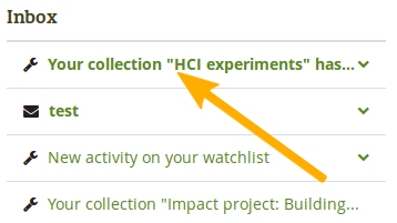
When you display messages from other users on your dashboard through the Inbox block, you can see quickly which messages you have not read. They are marked in bold.
Unread messages are displayed in bold
Latest changes I can view
The Latest changes I can view block displays the latest portfolios to which you have access across Mahara by other people. This includes pages and collections. Prior to Mahara 15.10 this block was called Latest pages.
This block can only be used on your dashboard.
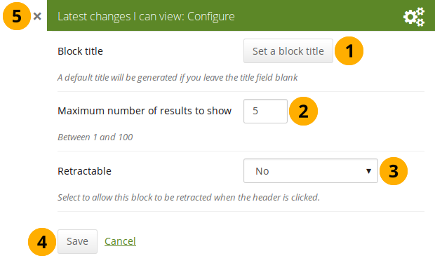
Configure the Latest changes I can view block
- Block title: The automatic title for this block is “Latest changes I can view”. You can set another one if you wish.
- Maximum number of results to show: Decide how many pages and collections shall be shown on your dashboard. You can choose between 1 and 100.
- Retractable: Choose whether you want to allow users to reduce the block to its heading on a page or see just the heading without the block content automatically. The options are:
- No: The block and its content is displayed at all times.
- Yes: Allow users to reduce the block to just the heading by clicking on the heading of a block where the Retractable icon is shown.
- Automatically retract: Only the heading of the block is visible, and the user can click on the heading of a block where the Retracted icon is shown to view its content.
- Click the Save button to accept your changes, or click the Cancel button to leave the block’s content as it is. The Remove button is shown only when you place the block into the page for the first time.
- You can also click the Close icon in the top left-hand corner to either remove a newly created block before it is being saved or to cancel any changes and leave the block’s content as it is.
The block on your dashboard page looks like the following.
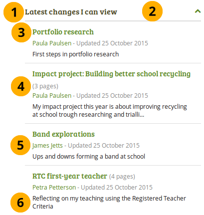
Example of the Latest changes I can view block
- Title of the block.
- If you chose a retractable option, you can click on the title or anywhere in the title space to change the block’s behaviour.
- Title of the page or collection to which you have access.
- If it is a collection, you see the number of pages contained within.
- Name of the portfolio author, and when the portfolio was last updated.
- Page or collection description.
Navigation
You must create at least one collection in order to use this block.
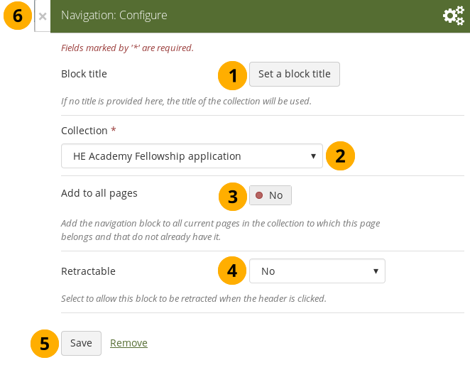
-
Block title: The title of the collection is chosen automatically unless you provide a different one.
-
Collection: Choose the collection from the drop-down menu for which you wish to display links in the block.
-
Add to all pages: Automatically add the block to all pages in the current collection with links to the selected collection.
If you add another page to the collection, it does not automatically receive the navigation block. You need to add it manually.
-
Retractable: Choose whether you want to allow users to reduce the block to its heading on a page or see just the heading only automatically. The options are:
- No: The block and its content is displayed at all times.
- Yes: Allow users to reduce the block to just the heading by clicking the Retractable icon .
- Automatically retract: Only the heading of the block is visible, and the user can click the Retracted icon to view its content.
-
Click the Save button to accept your changes, or click Cancel to leave the block’s content as it is. Remove is shown only when you place the block into the page for the first time.
-
You can also click the Close button in the top left-hand corner of the modal window to either remove a newly created block before it is being saved or to cancel any changes and leave the block’s content as it is.
Note
Add a note to your page. This feature is used when you do not want to keep the text in a journal, but still want to be able to re-use the text on other pages.
Add a new note
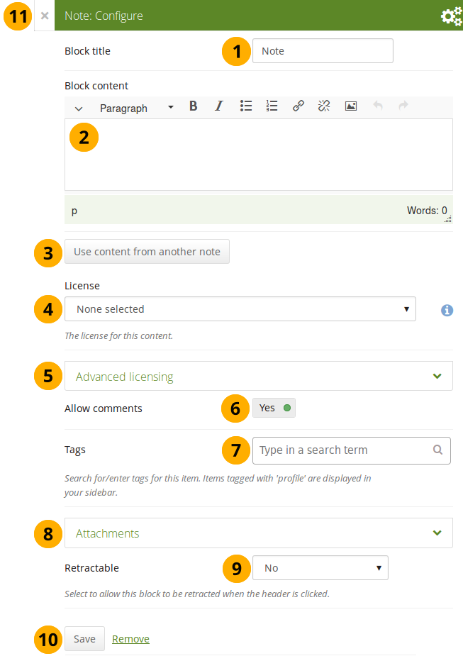
Configure the Note block
-
Block title: Provide a title for your note.
-
Block content: Write your text. You can include formatting, external images etc.
-
Alternatively, you can also use text from another note that you have already written. Click the Use content from another note button to do so.
-
License: You see this drop-down menu if the site administrator turned on license metadata. Additionally, if you are in an institution, your institution administrator may require you to provide a license. Your default license is displayed. You can set your default license in your account settings. You may choose a different license for each individual artefact.
-
Advanced licensing: If you can / must enter license information, you can also provide information about the original licensor and a URL where the original can be found.
-
Allow comments: Switch this setting to “No” if you do not want others to comment on your note. This option is set to “Yes” by default.
-
Tags: Enter tags to find your note more easily at a later stage. You can choose from your existing tags by starting to type a letter and then selecting the tag you want to use. You can also type a new tag, and it is added to your list of tags.
You can find more information on how to use the tag selector in the “Tags” section.
-
Attachments: Attach a file to a note as additional evidence for the text you are writing.
-
Retractable: Choose whether you want to allow users to reduce the block to its heading on a page or see just the heading only automatically. The options are:
- No: The block and its content is displayed at all times.
- Yes: Allow users to reduce the block to just the heading by clicking the Retractable icon .
- Automatically retract: Only the heading of the block is visible, and the user can click the Retracted icon to view its content.
-
Click the Save button to accept your changes, or click Cancel to leave the block’s content as it is. Remove is shown only when you place the block into the page for the first time.
-
You can also click the Close button in the top left-hand corner of the modal window to either remove a newly created block before it is being saved or to cancel any changes and leave the block’s content as it is.
Add an image into a note
Please refer to the section “Insert an image into text” for more information.
Attach a file to a note
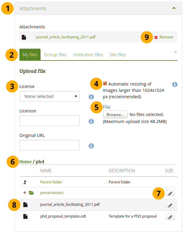
Attach a file to a Note block
-
Click the Attachments panel if you wish to add one or more files to a note.
-
Files area: Choose from which files area you would like to select a file:
- My files: You see all the folders and files that you have created.
- Group files: You see all the folders and files that you are allowed to publish.
- Institution files: If you are an institution administrator, you will see institution folders and files.
- Site files: If you are a site administrator, you will see all site folders and files. Otherwise, you can only see the ones that are in the folder public in the Site files.
-
License information: You see these fields if the site administrator turned on license metadata. Additionally, if you are in an institution, your institution administrator may require you to provide a license.
- License: Your default license is displayed. You can set your default license in your account settings. You may choose a different license for each individual artefact.
- Licensor: If you are uploading a file that somebody else created, you can attribute the work to them here and provide their name for example.
- Original URL: If you are uploading somebody else’s file, provide a link to the original Internet address so that others can go there and view the original file.
-
If the site administrator turned on the image resizing option, you can decide whether you want to have your images resized if they are larger than the specified dimensions. This option is recommended to save space in your portfolio.
-
File: You do not have to go back to your Files area in Create in order to upload a file. You can do so directly from this screen.
-
Folder path: The breadcrumbs show in which folder you are currently.
-
Click the Edit button to change any component of a folder or file, i.e. its name, description and tags. If you have a folder or file included in a page that you submitted for feedback, you will not be able to edit them.
You can also still select files that have been submitted in another portfolio page.
-
Click into the row that contains the file you wish to display in the block to select it.
When you place group, institution or site files into a page, beware that these files may not be available at some point anymore when the person in charge deletes them.
-
Click Remove if you want to revert your selection.
-
Continue editing your note and save it.
Re-use text from an existing note
You can re-use text from other note from one page in another without having to copy the page first.
If you do not make a copy of the note content in the block configuration and change it, the text is changed in all other instances where this note is used.
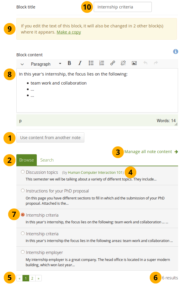
Configure the Note block by copying text
-
Click the button Use content from another note to view all notes to which you have access. These can be:
- your own notes
- notes from group pages that you can copy
- notes from institution or site pages to which you have access
-
Click Browse or Search to find the note that you want to re-use.
The search is performed in the title, description, and tags.
-
Click the Manage all note content link to be taken to your personal Notes if you can’t find what you are looking for.
-
All notes are listed with their title and the first line. If a note does not belong to you but for example to a group, you see the author next to the note’s title.
-
Use the paginator to move between your notes if more than 5 are displayed.
-
You see the number of notes that you have access to.
-
Click the radio button in front of a note that you want to use in this page.
-
The content of the note that you have selected is displayed in the Block content box. Now you can make changes.
The text will be changed in all other instances where this note appears.
-
If you wish to make changes to the note, but do not want to change it everywhere else, click the Make a copy link above the Block content. The text is then retained, but it is treated like a new note and the original note is not changed.
-
Block title: Review the block title and make changes if necessary. Once you copied a note, the original block title is entered here.
You can change the block title no matter whether you change the content of the note or not.
-
All other functionality that you see on the screen is the same as for adding a new note.
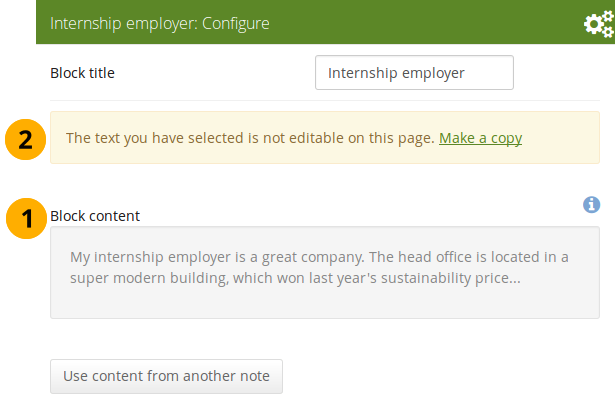
Open a note that is submitted for assessment in another portfolio
- Block content: When you open a note that is used on a page that is currently submitted, you cannot make changes to the note.
- Click the Make a copy link in order to make changes to this note on this page only. It is not changed on the other page that is submitted or on any other page where the text appears.
Peer assessment
Allow peer reviewers to give blind feedback.
Add the peer assessment block to a page
This block allows somebody else to provide blind feedback on the portfolio author, e.g. in a formal assessment context where skills and competencies need to be assessed by the peer independently of what the portfolio author has stated.
The peer reviewer can see block headings, but not the content in the blocks themselves. If the portfolio consists of multiple pages, and one of them does not contain a peer block, the peer reviewer does not see the page content at all.
You must give a person the “Peer” role when sharing the portfolio page for them to be able to add their assessment.
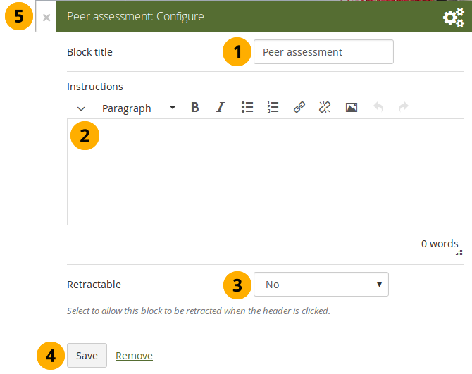
Configure the Peer assessment block
- Block title: The title that you want to give this particular block.
- Instructions: Provide instructions for the peer reviewer to help them with their assessment.
- Retractable: Choose whether you want to allow users to reduce the block to its heading on a page or see just the heading only automatically. The options are:
- No: The block and its content is displayed at all times.
- Yes: Allow users to reduce the block to just the heading by clicking the Retractable icon .
- Automatically retract: Only the heading of the block is visible, and the user can click the Retracted icon to view its content.
- Click the Save button to accept your changes, or click Cancel to leave the block’s content as it is. Remove is shown only when you place the block into the page for the first time.
- You can also click the Close button in the top left-hand corner of the modal window to either remove a newly created block before it is being saved or to cancel any changes and leave the block’s content as it is.
Set up a peer assessor
You can give someone the peer assessment permissions on the Edit access screen of your portfolio page.
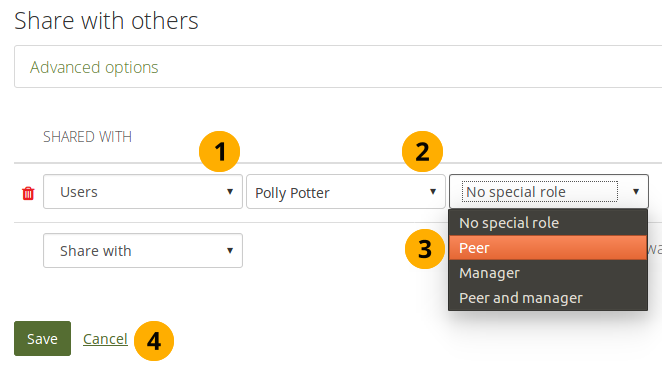
Give someone peer assessment permissions
If the page is in a collection that contains pages that don’t have the peer assessment block, the peer assessor doesn’t see any content on those pages but the notice “You cannot see the content on this page because it does not require a peer assessment.”
Add a peer assessment
Peer assessments are blind assessments at the moment allowing the peer assessor to give their feedback independently of the portfolio author.
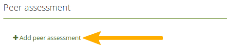
Add a peer assessment
When you are the peer assessor on someone’s portfolio, and a page contains a peer assessment block, you can add your assessment by clicking the Add peer assessment link.
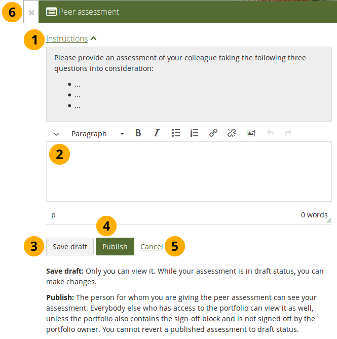
Write a peer assessment
-
Click the Instructions link to view the instructions for the peer assessment.
-
Write your peer assessment.
-
Click the Save draft button if you are not yet ready for the portfolio author to view your assessment, and you want to save a draft status.
-
Click the Publish button when you finished your assessment, and the portfolio author can view it. A notification is also sent to the portfolio author.
If the peer assessment block is used in conjunction with the sign-off block, the portfolio author must sign off the page before anybody other than themselves and the peer assessor can see published peer assessments.
View a peer assessment
If a peer assessment is in draft mode, only the peer assessor can see it. Once it’s published, others can view it as well.
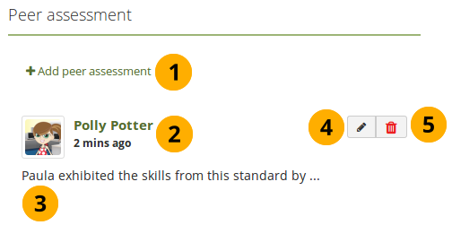
View a peer assessment
- Click the Add peer assessment link if you want to add (another) peer assessment when you cannot edit an earlier one in the same block anymore.
- The profile picture and name of the peer assessor are displayed along with the date and time when the peer assessment was made.
- The peer assessment is displayed.
- The Edit button is only displayed to the peer assessor for 10 minutes after publishing the assessment in case there are last minute changes they want to make.
- The Delete button is only shown to the peer assessor, and they can delete their assessment at any point. If they do, the portfolio author receives an email about that with the text of the assessment included.
Plans
Display your plans in a block.
You must create at least one plan in order to use this block.
Configure the Plans block
- Block title: The title of the plan is chosen automatically unless you provide a different one.
- Plans to show: Choose the plan or plans which you want to display in your page.
- Tasks to display: Decide how many tasks you want to display for each plan before a paginator is displayed.
- Retractable: Choose whether you want to allow users to reduce the block to its heading on a page or see just the heading only automatically. The options are:
- No: The block and its content is displayed at all times.
- Yes: Allow users to reduce the block to just the heading by clicking the Retractable icon .
- Automatically retract: Only the heading of the block is visible, and the user can click the Retracted icon to view its content.
- Click the Save button to accept your changes, or click Cancel to leave the block’s content as it is. Remove is shown only when you place the block into the page for the first time.
- You can also click the Close button in the top left-hand corner of the modal window to either remove a newly created block before it is being saved or to cancel any changes and leave the block’s content as it is.
Result of an embedded plan in a portfolio page. By clicking on the linked titles, you can show the descriptions of the individual tasks.
Recent forum posts
Display a specified number of recent forum posts from one group on a page.
You must be a member of at least one group in order to use this block.
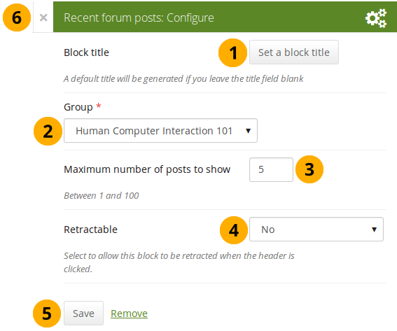
Configure the Recent forum posts block
- Block title: The title of the block is generated automatically unless you provide a different one. The default title is “Recent forum posts”.
- Group: Choose the group whose forum posts you wish to display.
- Maximum number of posts to show: Decide how many of the latest forum posts you wish to show. The default value is 5. You can show up to 100 posts.
- Retractable: Choose whether you want to allow users to reduce the block to its heading on a page or see just the heading only automatically. The options are:
- No: The block and its content is displayed at all times.
- Yes: Allow users to reduce the block to just the heading by clicking the Retractable icon .
- Automatically retract: Only the heading of the block is visible, and the user can click the Retracted icon to view its content.
- Click the Save button to accept your changes, or click Cancel to leave the block’s content as it is. Remove is shown only when you place the block into the page for the first time.
- You can also click the Close button in the top left-hand corner of the modal window to either remove a newly created block before it is being saved or to cancel any changes and leave the block’s content as it is.
Sign-off
The sign-off and verification process allows for a visual indicator on a portfolio page showing whether the page has been finished and whether a manager has verified it before it can go for the final assessment. The verification by a manager is optional.
Set up a page for sign-off and verification
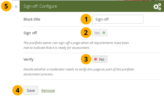
Configure the Sign-off block
-
Block title: Give the block a title. This is not required as the options will sit right below the page heading rather than in a block on the page itself when in view mode.
-
Sign off: A sign-off by the portfolo author is always required.
-
Verify: Give a person with the “Manager” permission the opportunity to verify a page and state that fact to carry it one step further in the assessment. Page content will not be locked when the verification has been made.
The manager cannot revoke the verification. This can only be done by the portfolio author in form of revoking the sign-off for the page.
Set up a manager for verification
You can give someone the manager permissions on the Edit access screen of your portfolio page to allow them to verify your portfolio.
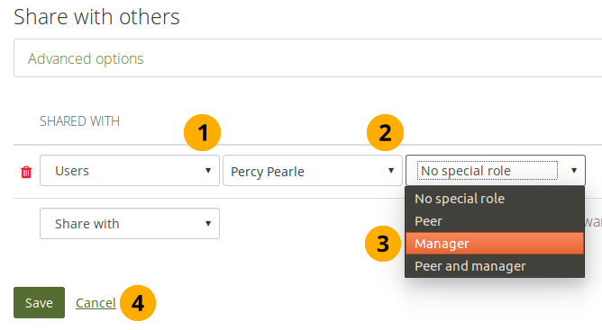
Give someone manager permissions
Sign off a page
When you have a sign-off block on your page and you view it, you can see the sign-off and verification options below the page heading to the right.
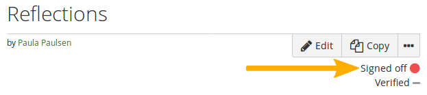
View the sign-off as portfolio autor
When you are ready to sign off your page, you can click the red dot icon , and it will turn into a green tick icon to indicate that the page has been signed off.
If the page also needs a verification, your manager can now perform it.
Verify a page
As manager, you can see the sign-off and verification options below the page heading to the right. You can only tick the verification option.
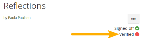
Verify a page as manager
When you are ready to verify a page that allows for verification, you can click the red dot icon , and it will turn into a green tick icon to indicate that the page has been verified.
You cannot revoke the verification. Only the portfolio author can do so by revoking the sign-off.
Text
Add text to your page. This feature is used when you want to put a snippet of text onto a page that does not have to be re-used.
In a default Mahara instance, this block is available in the content chooser at the top together with the Image block. It does not appear in the section General as well.
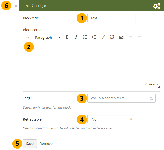
Configure the Text block
- Block title: Provide a title for your text.
- Block content: Write your text. You can include formatting, external images etc.
- Tags: Enter tags for this block to find this content more easily. The tags are displayed as part of the page tags.
- Retractable: Choose whether you want to allow users to reduce the block to its heading on a page or see just the heading only automatically. The options are:
- No: The block and its content is displayed at all times.
- Yes: Allow users to reduce the block to just the heading by clicking the Retractable icon .
- Automatically retract: Only the heading of the block is visible, and the user can click the Retracted icon to view its content.
- Click the Save button to accept your changes, or click Cancel to leave the block’s content as it is. Remove is shown only when you place the block into the page for the first time.
- You can also click the Close button in the top left-hand corner of the modal window to either remove a newly created block before it is being saved or to cancel any changes and leave the block’s content as it is.
Please refer to the section “Insert an image into text” for more information on adding an image to the text block.
Watched pages
The Watched pages block displays the pages that are either on your watchlist or belong to your friends and you have access to them.
You can only use this block on your dashboard.
Pages on my watchlist
If you want pages to be displayed, you need to add them to it first by clicking the More options button on a page and then add the page to your watchlist.
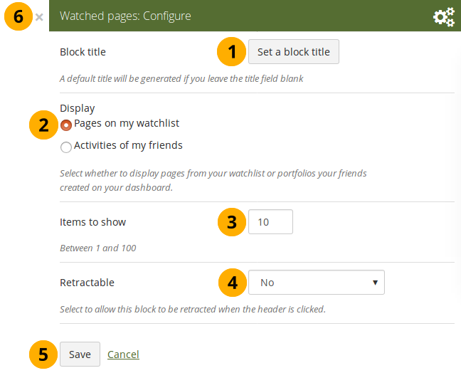
Configure the Watched pages block for your watchlist
- Block title: The automatic title for this block is “Watched pages”. You can set another one if you wish.
- Select to display Pages on my watchlist.
- Items to show: Decide how many pages shall be shown on your dashboard. You can choose between 1 and 100.
- Retractable: Choose whether you want to allow users to reduce the block to its heading on a page or see just the heading without the block content automatically. The options are:
- No: The block and its content is displayed at all times.
- Yes: Allow users to reduce the block to just the heading by clicking the Retractable icon .
- Automatically retract: Only the heading of the block is visible, and the user can click the Retracted icon to view its content.
- Click the Save button to accept your changes, or click the Cancel button to leave the block’s content as it is. The Remove button is shown only when you place the block into the page for the first time.
- You can also click the Close button in the top right-hand corner to either remove a newly created block before it is being saved or to cancel any changes and leave the block’s content as it is.
View your watchlist on your dashboard.
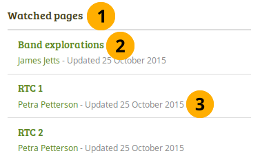
View the Watched pages block
-
Title of the block.
If you chose a retractable option, you can click on the title or anywhere in the title space to change the block’s behaviour.
-
Title of the watched page. You can click the link to be taken to her.
-
View the page owner and the date when the page was last updated. This is in particular important information when all your watched pages have the same or a similar title.
Activities of my friends
If you have friends on Mahara, then you can use this block to display their portfolios when they have shared them with you:
- personally
- as a member of a group
- as an institution member
- as a registered user
- publicly
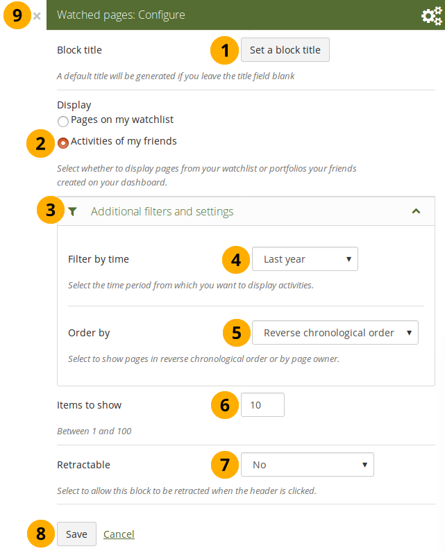
Configure the Watched pages block for your friend activity
- Block title: The automatic title for this block is “Watched pages”. You can set another one if you wish.
- Select to display Activities of my friends.
- Click Additional filters and settings to make additional changes.
- Filter by time: You can select the time period over which you want to see changes. Your options are:
- Last week
- Last month
- Last 2 months
- Last 3 months
- Last 6 months
- Last year
- Since last login
- Order by: Decide how the portfolios are to be ordered. Your choices are:
- Reverse chronological order: Display the latest changes first
- Page owner: Display all pages by their owner with the one having made changes last first.
- Items to show: Decide how many pages shall be shown on your dashboard. You can choose between 1 and 100.
- Retractable: Choose whether you want to allow users to reduce the block to its heading on a page or see just the heading without the block content automatically. The options are:
- No: The block and its content is displayed at all times.
- Yes: Allow users to reduce the block to just the heading by clicking the Retractable icon .
- Automatically retract: Only the heading of the block is visible, and the user can click the Retracted icon to view its content.
- Click the Save button to accept your changes, or click the Cancel button to leave the block’s content as it is. The Remove button is shown only when you place the block into the page for the first time.
- You can also click the Close button in the top right-hand corner to either remove a newly created block before it is being saved or to cancel any changes and leave the block’s content as it is.
Personal info
The artefact blocks in this tab allow you to include information that you provided in the profile into your portfolio. If you want to make changes to the text or the images, go to User menu → Profile.
Furthermore, you can also put certain blocks on your profile page that only exist for that particular page:
- My friends
- My groups
- My pages
- Wall
My friends
Add a block that displays your friends’ profile pictures and their names to your profile page. This is a default block on your profile page.
You only need to place the block on your profile page. There is no further configuration possible.
My groups
Add a block that displays your groups on your profile page. It is a standard profile page block. You can decide on the sort order of the groups and also limit the number of groups to be shown before a paginator is displayed.
Configure the My groups block
-
Sort groups: Decide in which sort order your groups should be displayed:
- Most recently joined: Groups are displayed in chronologically reverse order to show the groups that you joined recently first.
- Earliest joined: This option displays your groups in the order in which you joined them.
- A to Z: Alphabetically from A to Z. This is the default option.
- Maximum number of groups to display: Decide how many groups you wish to display in the block before the paginator is shown and the remaining pages can be seen on the next page within the block. Leave this field empty if you wish to display all your groups.
-
Retractable: Choose whether you want to allow users to reduce the block to its heading on a page or see just the heading only automatically. The options are:
- No: The block and its content is displayed at all times.
- Yes: Allow users to reduce the block to just the heading by clicking the Retractable icon .
- Automatically retract: Only the heading of the block is visible, and the user can click the Retracted icon to view its content.
- Click the Save button to accept your changes, or click Cancel to leave the block’s content as it is. Remove is shown only when you place the block into the page for the first time.
- You can also click the Close button in the top left-hand corner of the modal window to either remove a newly created block before it is being saved or to cancel any changes and leave the block’s content as it is.
My portfolios
Add a block that displays your pages and collections on your profile or dashboard page. It is a standard profile page block. This block should stay on your profile page because other users can see all your pages and collections to which they have acceess.
You only need to place the block on your profile page. There is no further configuration possible.
When other users view your profile page, they only see the pages and collections to which they have access. That also means that you see all your pages and collections while others may see none or just a few.
You see the following when you use the block.
The My portfolios block displayed in a page
- Block title
- Title of the page or collection to which you have access.
- If it is a collection, you see the number of pages contained within.
- Page or collection description.
- Paginator to view more portfolios.
- Number of portfolios that you can view.
- If you would like to see fewer or more portfolios, you can change that here. Per default, 10 portfolios are displayed.
Profile information
Add a block with profile fields to your page.
Only display as much information as you wish anybody to see. Especially when you make your pages available to the public, i.e. everybody on the Internet, or all logged-in users, decide carefully whether you want to display your street address and / or phone number.
Configure the Profile information block
- Block title: Choose a title for your block.
- Fields to show: Decide which fields shall appear on the page. Put a check mark in front of each one that you want to show. Displayed are only the ones for which you provided content.
- Profile picture: Choose to display one of your profile pictures or “Don’t show a profile picture”.
- Email address Decide whether to display one of your email addresses that you have entered in your profile under User menu → Profile.
- Introduction text: If you do not want to display the introduction text from your profile, you can write another one just for this page here. However, it will be lost when you delete this block.
-
Retractable: Choose whether you want to allow users to reduce the block to its heading on a page or see just the heading only automatically. The options are:
- No: The block and its content is displayed at all times.
- Yes: Allow users to reduce the block to just the heading by clicking the Retractable icon .
- Automatically retract: Only the heading of the block is visible, and the user can click the Retracted icon to view its content.
- Click the Save button to accept your changes, or click Cancel to leave the block’s content as it is. Remove is shown only when you place the block into the page for the first time.
- You can also click the Close button in the top left-hand corner of the modal window to either remove a newly created block before it is being saved or to cancel any changes and leave the block’s content as it is.
Social media
Add a block with links to your social networks to your page.
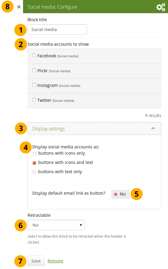
Configure the Social media block
-
Block title: Choose a title for your block.
-
Social media accounts to show: Decide which accounts shall appear on the page. Put a check mark in front of each one that you want to show. Displayed are only the ones for which you provided content.
-
Display settings: Click this panel heading to show the possible display settings.
-
Display social media accounts as: Decide which way you want to display the links to your social media accounts:
- Buttons with icons only: Show only the logos of the social media accounts. This option is a good one if you have lots of accounts and want to save space on your page. However, it might be trickier for people to know instantly which accounts are displayed if they are not familiar with the logos.
If you added a lot of social media accounts through the option “Other”, this option here would not be a good one as the logo for all the services is just a generic icon.
- Buttons with icons and text: This is the default option. The logo of the social network is displayed along with its name.
- Buttons with text only: This option only displays the name of the social network.
-
Display default email link as button? Switch this option to “Yes” if you want to provide a button for your primary email address.
-
Retractable: Choose whether you want to allow users to reduce the block to its heading on a page or see just the heading only automatically. The options are:
- No: The block and its content is displayed at all times.
- Yes: Allow users to reduce the block to just the heading by clicking the Retractable icon .
- Automatically retract: Only the heading of the block is visible, and the user can click the Retracted icon to view its content.
-
Click the Save button to accept your changes, or click Cancel to leave the block’s content as it is. Remove is shown only when you place the block into the page for the first time.
-
You can also click the Close button in the top left-hand corner of the modal window to either remove a newly created block before it is being saved or to cancel any changes and leave the block’s content as it is.
This is how the individual options are displayed on your page.
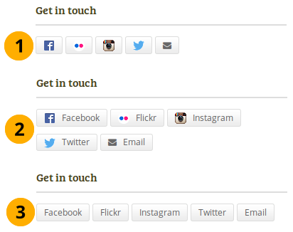
The 3 options for displaying your social media accounts
Wall
Add a block that displays your wall on your profile page. It is a standard profile page block. Other users can leave messages for you, i.e. write on your wall, and they can decide whether everyone looking at your profile page can see them or only they and you.
You only need to place the block on your profile page. There is no further configuration possible.
When you view your wall (or someone else’s wall) on your profile page, you see the following.
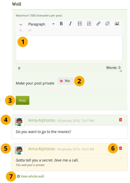
A wall on a profile page
- Enter your message in the text box. You can use the visual editor to format your message.
- Make your post private: Decide who shall see your wall post. If you make it private, only you and the person to whose wall you are posting will see the post.
- Click the Post button to add your message to the wall.
- A wall post always contains the name of the person who made the post, the date and the actual message. A public wall post can be viewed by anyone who has access to the profile page.
- Wall posts that are private are highlighted.
- Click the Delete icon if you do not want to have a specific post on your wall. The post authors and you as owner of your wall can delete posts.
- Click the View whole wall link to see all wall posts.
When somebody else leaves a message on your wall, you receive a notification and have that sent to your inbox. Other people are not notified about new messages on your wall.
Résumé
You can display either your entire résumé or parts of it in any portfolio page. If you choose to display only parts of your résumé, you have more control over the arrangement of the information.
My entire résumé
Add a block with your entire résumé to your page.
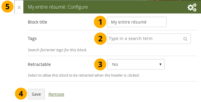
Configure the My entire résumé block
- Block title: Choose a title for your block.
- Tags: Enter tags for this block to find this content more easily. The tags are displayed as part of the page tags.
-
Retractable: Choose whether you want to allow users to reduce the block to its heading on a page or see just the heading only automatically. The options are:
- No: The block and its content is displayed at all times.
- Yes: Allow users to reduce the block to just the heading by clicking the Retractable icon .
- Automatically retract: Only the heading of the block is visible, and the user can click the Retracted icon to view its content.
- Click the Save button to accept your changes, or click Cancel to leave the block’s content as it is. Remove is shown only when you place the block into the page for the first time.
- You can also click the Close button in the top left-hand corner of the modal window to either remove a newly created block before it is being saved or to cancel any changes and leave the block’s content as it is.
When you use this block, you do not have control over the order in which the information is displayed, but Mahara decides that. In order to be more flexible, you can choose to display one résumé field at a time with the One résumé field block.
One résumé field
Add a block with one résumé field to your page.
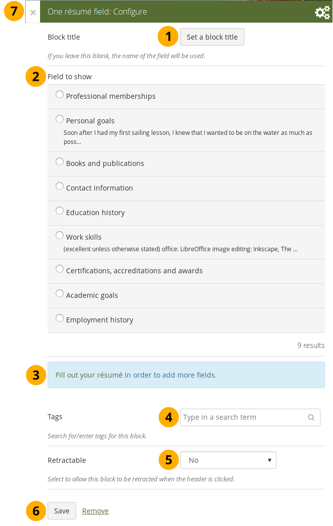
Configure the One résumé field block
- Block title: The title of the résumé field you want to display is chosen automatically unless you provide a different one.
- Field to show: Choose the résumé information that you want to display. You can select one area at a time.
- You can jump to the résumé section directly from this modal window in order to fill in more content.
- Tags: Enter tags for this block to find this content more easily. The tags are displayed as part of the page tags.
-
Retractable: Choose whether you want to allow users to reduce the block to its heading on a page or see just the heading only automatically. The options are:
- No: The block and its content is displayed at all times.
- Yes: Allow users to reduce the block to just the heading by clicking the Retractable icon .
- Automatically retract: Only the heading of the block is visible, and the user can click the Retracted icon to view its content.
- Click the Save button to accept your changes, or click Cancel to leave the block’s content as it is. Remove is shown only when you place the block into the page for the first time.
- You can also click the Close button in the top left-hand corner of the modal window to either remove a newly created block before it is being saved or to cancel any changes and leave the block’s content as it is.
External content
With the help of the external content blocks, you can include RSS feeds, external media or GoogleApps documents etc. into a page.
External feed
Embed an external RSS or ATOM feed, e.g. to display an external blog.
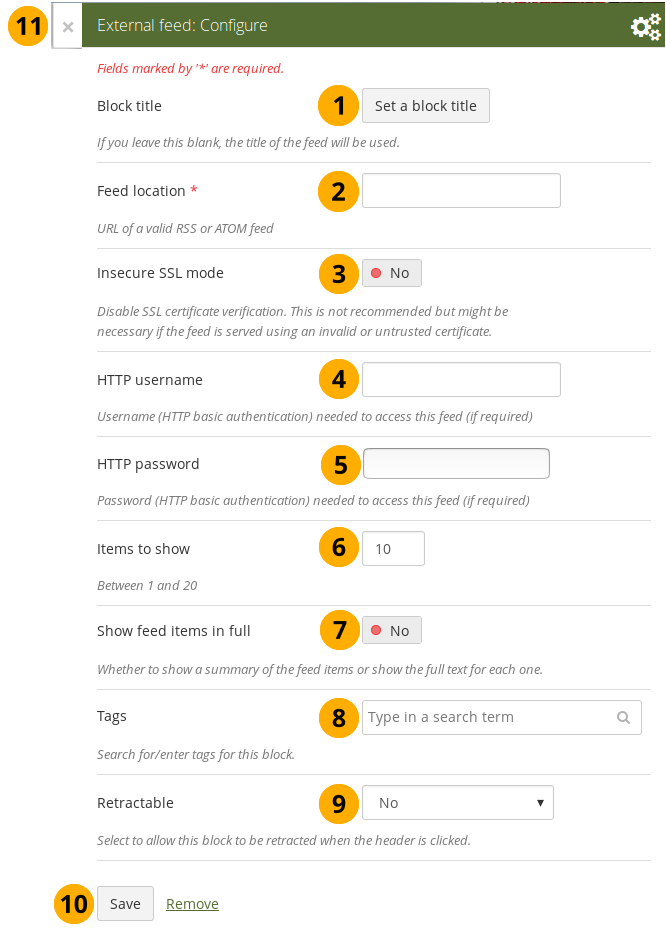
Configure the external feed block
-
Block title: If you leave the title blank, the title of the feed will be used.
-
Feed location: Put the entire feed URL from a valid RSS or ATOM feed in here. If the feed is not displayed, try to view it in a regular feed reader to make sure that the URL is correct. You must provide a feed URL here.
Unfortunately, Firefox and Chrome do not display the RSS feed icon for a page immediately near the address bar anymore. In Firefox you will have to go to View → Toolbars → Customize and then drag the RSS icon to your toolbar. It lights up orange / white when a feed is available.
If you use Chrome, you will have to install the RSS Subscription Extension.
-
Insecure SSL mode: Switch this option to “Yes” if you wish to enable the insecure SSL mode. This mode allows you to override certificate errors generated by a feed.
-
HTTP username: Provide a username if you wish to access a feed that requires authentication. This is the username to access the feed and not your portfolio system.
-
HTTP password: Provide a password to access a feed that requires authentication. This is the password to access the feed and not your portfolio system.
-
Items to show: Decide how many of the latest items in the feed you wish to display. You can choose up to 20.
-
Show feed items in full: Switch this option to “Yes” if you want to see the entire feed content and not only the heading of a blog post.
-
Tags: Enter tags for this block to find this content more easily. The tags are displayed as part of the page tags.
-
Retractable: Choose whether you want to allow users to reduce the block to its heading on a page or see just the heading only automatically. The options are:
- No: The block and its content is displayed at all times.
- Yes: Allow users to reduce the block to just the heading by clicking the Retractable icon .
- Automatically retract: Only the heading of the block is visible, and the user can click the Retracted icon to view its content.
-
Click the Save button to accept your changes, or click Cancel to leave the block’s content as it is. Remove is shown only when you place the block into the page for the first time.
-
You can also click the Close button in the top left-hand corner of the modal window to either remove a newly created block before it is being saved or to cancel any changes and leave the block’s content as it is.
If your feed is not updated automatically, please ask your site administrator to check the cron settings.
If you click an entry in the RSS feed, it will open in a new window.
External media
With this block you can embed content from a wide variety of third-party sites. The sites that are allowed are listed below the text area in the configuration screen. You see only their favicons, but when you hover over an icon with your mouse, you see the site’s name as well.
Mahara comes with a number of sites that are allowed per default. These are listed on the page. Your site administrator can add additional iframe sources.
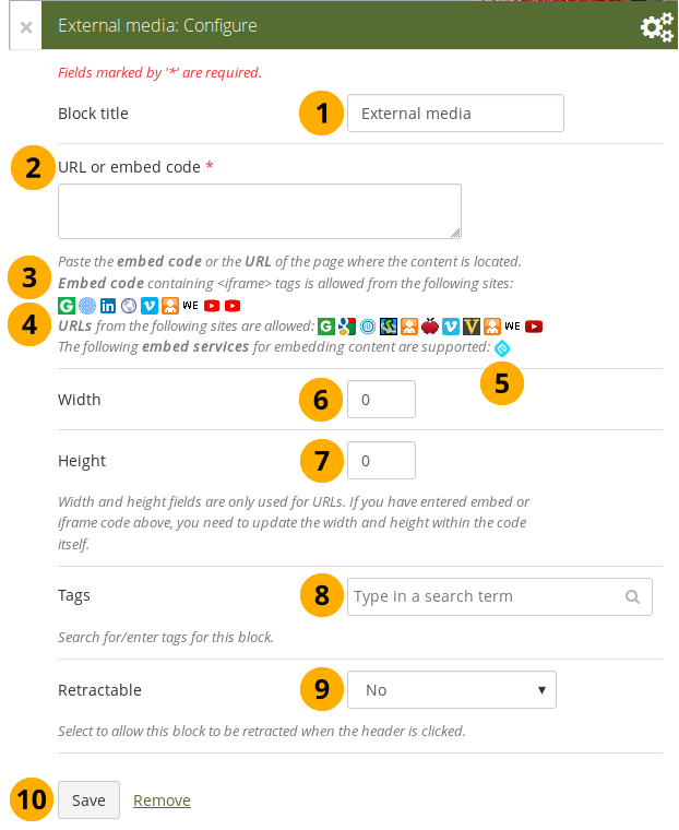
Configure the external media block
-
Block title: Choose a title for your embedded content.
-
URL or embed code: Paste the URL or the embed code of a page where the content is located.
-
Embed code: Content from the sites listed in this section can be embedded using the <iframe> embed code. Any new site that the site administrator allows will be added in alphabetical order. The default sites are:
-
URLs: Content from the sites listed in this section can be embedded by simply grabbing the page URLs where the content can be found. The default sites are:
-
You can also paste an Embedly embed code and display your content that way.
-
Width: Choose the width (in pixels) that the content should take up on the page. This only goes for the content for which you provided the URL.
If you use the embed code, you need to provide the correct width and height directly in the embed code and can ignore this setting here.
-
Height: Choose the height (in pixels) that the content should take up on the page. This only goes for the content for which you provided the URL.
If you use the embed code, you need to provide the correct width and height directly in the embed code and can ignore this setting here.
-
Tags: Enter tags for this block to find this content more easily. The tags are displayed as part of the page tags.
-
Retractable: Choose whether you want to allow users to reduce the block to its heading on a page or see just the heading only automatically. The options are:
- No: The block and its content is displayed at all times.
- Yes: Allow users to reduce the block to just the heading by clicking the Retractable icon .
- Automatically retract: Only the heading of the block is visible, and the user can click the Retracted icon to view its content.
-
Click the Save button to accept your changes, or click Cancel to leave the block’s content as it is. Remove is shown only when you place the block into the page for the first time.
-
You can also click the Close button in the top left-hand corner of the modal window to either remove a newly created block before it is being saved or to cancel any changes and leave the block’s content as it is.
You can use the same iframe embed code around Mahara in notes, text and journal entries as well.
Watch the video Saving a video from iPad to MyPortfolio if you want to see how you can embed a YouTube video into your Mahara portfolio using an iPad. You can use a similar work flow for adding YouTube videos also via Android or on your computer. “MyPortfolio” is the name of a Mahara instance in New Zealand for schools.
Google Apps
Embed any of the following content available via Google (Apps):
- books
- calendars
- documents, spreadsheets, presentations
- maps
You can only display the content, but not immediately edit documents, spreadsheets or presentations. You will have to be logged in to your Google (Apps) account to do so. You can use this block with a regular, personal Google account or if you have a Google Apps account via an institution, e.g. your school or university.
If certain documents are restricted to a Google Apps domain or to specific people, a login screen is displayed.
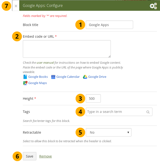
Configure the Google Apps block
- Block title: Choose a title for your embedded content.
- Embed code or URL: Depending on what kind of content you wish to display, you either provide the embed code or the URL. Click the Help button for more information on how to embed each Google component.
- Height: Choose the height for the embedded content. The width is adjusted to the column width of the block automatically.
- Tags: Enter tags for this block to find this content more easily. The tags are displayed as part of the page tags.
-
Retractable: Choose whether you want to allow users to reduce the block to its heading on a page or see just the heading only automatically. The options are:
- No: The block and its content is displayed at all times.
- Yes: Allow users to reduce the block to just the heading by clicking the Retractable icon .
- Automatically retract: Only the heading of the block is visible, and the user can click the Retracted icon to view its content.
- Click the Save button to accept your changes, or click Cancel to leave the block’s content as it is. Remove is shown only when you place the block into the page for the first time.
- You can also click the Close button in the top left-hand corner of the modal window to either remove a newly created block before it is being saved or to cancel any changes and leave the block’s content as it is.
Google document
- Open the document.
- Click File in the menu bar and then Publish to the Web.
- Click the Start publishing button.
- Copy the document link or embed code.
- Paste the link or embed code into the Embed code or URL box in the Google Apps block.
Google spreadsheet
- Open the spreadsheet.
- Click File in the menu bar and then Publish to the Web.
- Click the Start publishing button.
- Read through the other options and decide on them.
- Copy the link for the option Web page or the embed code for the option HTML to embed in a page.
- Paste the link or embed code into the Embed code or URL box in the Google Apps block.
Google presentation
- Open the presentation.
- Click File in the menu bar and then Publish to the Web.
- Click the Start publishing button.
- Copy the link or embed code.
- Paste the link or embed code into the Embed code or URL box in the Google Apps block.
Google Drive folder
- Select the folder that you want to share.
- Click the Link icon. A shareable link is created.
- Copy the link.
- Paste the link into the Embed code or URL box in the Google Apps block.
Google Calendar
- Open Google Calendar.
- Click on the little triangle next to the calendar that you wish to embed.
- Click on Calendar settings.
- On the Calendar details tab scroll down to Embed This Calendar.
- Customize the calendar appearance and then copy the embed code.
- Paste the embed code into the Embed code or URL box in the Google Apps block.
Google Maps
- Open Google Maps.
- Click the My Places button.
- Click on the name of the map that you wish to embed.
- Click on the Link icon to the left of the map.
- Customize the appearance of the map and copy the embed code.
- Paste the embed code into the Embed code or URL box in the Google Apps block.
Use steps 2 and 3 only if you wish to embed one of your Google maps. If you wish to embed any Google map, you can skip these steps.
Google Books
- Open Google Books.
- Find the book that you wish to embed.
- Click on the book title.
- Click on the Link icon above the book.
- Copy the embed code of the book.
- Paste the embed code into the Embed code or URL box in the Google Apps block.
The link icon only appears if you are allowed to embed this book.
Badges
Open Badges are an answer for showing recognition of skills and competencies online with the help of an open framework.
Configure the block
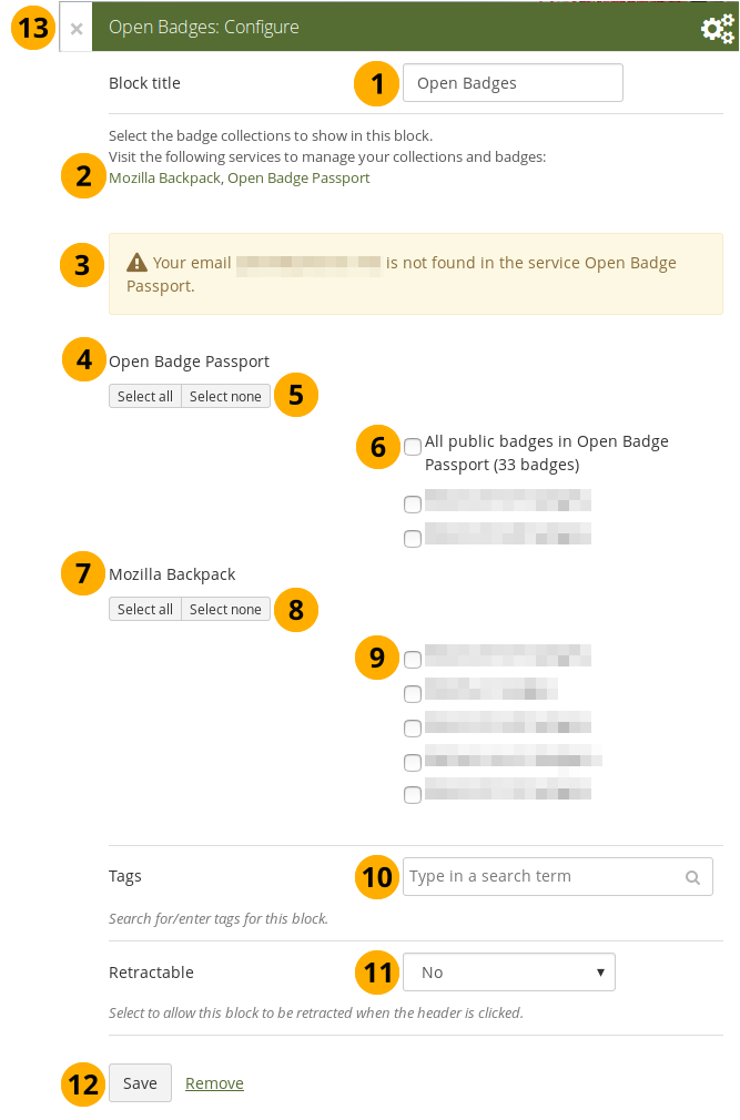
Configure the Open Badges block
-
Block title: Choose a title for your block.
-
If you do not see all your public badge collections, click the links to verify that you have made all badges publicly available that you want to see.
-
Mahara checks the backpacks for all email addresses that are associated with your account. If it can’t find any badges to display for a particular address, it’ll show a notice.
-
Open Badge Passport: All public badge collections from your Open Badge Passport are displayed.
If you have other “backpacks” that contain badges, the site administrator would need to allow them in the config.php.
-
Use the Select all or Select none buttons to select all badge collections or to revert your selection.
-
You can also select individual badge collections if you prefer by ticking their checkboxes.
-
Mozilla Backpack: All public badge collections from your backpack are displayed.
-
Use the Select all or Select none buttons to select all badge collections or to revert your selection.
-
You can also select individual badge collections if you prefer by ticking their checkboxes.
-
Tags: Enter tags for this block to find this content more easily. The tags are displayed as part of the page tags.
-
Retractable: Choose whether you want to allow users to reduce the block to its heading on a page or see just the heading only automatically. The options are:
- No: The block and its content is displayed at all times.
- Yes: Allow users to reduce the block to just the heading by clicking the Retractable icon .
- Automatically retract: Only the heading of the block is visible, and the user can click the Retracted icon to view its content.
-
Click the Save button to accept your changes, or click Cancel to leave the block’s content as it is. Remove is shown only when you place the block into the page for the first time.
-
You can also click the Close button in the top left-hand corner of the modal window to either remove a newly created block before it is being saved or to cancel any changes and leave the block’s content as it is.
Since your badges need to be fetched from an external service, it may take a little bit until they are displayed on the page.
Create a collection of badges in the Mozilla Backpack
Drag a badge onto a new collection space
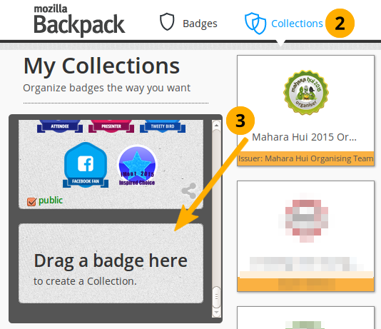
-
Go to your Mozilla Backpack. You must have already pushed at least one badge to it to complete the following steps.
-
Click the Collection navigation item to enter your badge collection area.
-
Drag one of your badges onto a (new) collection space.
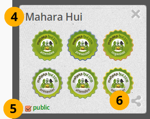
Create a new collection
-
Give your new collection a title by clicking onto “New collection” and typing your title.
-
Tick the checkbox public so others can see your badges.
-
Click the Share icon. You will be taken to a page where you can see all the badges in the collection that you created.
Blocks in various pages
Certain blocks can only exist in certain page contexts. For example, the wall can only be placed on the profile page whereas a note can be used on any page. There are a number of page contexts which can have different blocks:
- portfolio page
- group page
- institution page
- site page
- profile page
- dashboard page
The following list shows in which contexts a specific block and therefore a specific artefact can be used. It also shows which blocks can be copied.
Note
Blocks in a page that are copied from one user to another need to be checked for content accuracy and whether they can be retained as they are or need to be updated.
Blocks that display a * next to their check mark can be added to a group, institution, or site page and configured where possible to help with setting up templates. No content is displayed though when the page is viewed because user-specific content is required.
4.3.6.1. Files, images and video
| Block | User | Group | Institution | Site | Dashboard | Profile | Group homepage | Copyable |
|---|---|---|---|---|---|---|---|---|
|
|
||||||||
|
|
||||||||
|
|
||||||||
|
|
||||||||
|
|
||||||||
|
|
||||||||
|
|
4.3.6.2. Journals
| Block | User | Group | Institution | Site | Dashboard | Profile | Group homepage | Copyable |
|---|---|---|---|---|---|---|---|---|
|
|
||||||||
|
|
||||||||
|
|
||||||||
|
|
4.3.6.3. General
| Block | User | Group | Institution | Site | Dashboard | Profile | Group homepage | Copyable |
|---|---|---|---|---|---|---|---|---|
|
|
||||||||
|
|
||||||||
|
|
||||||||
|
|
||||||||
|
|
||||||||
|
|
||||||||
|
|
||||||||
|
|
||||||||
|
|
||||||||
|
|
||||||||
|
|
||||||||
|
|
* | * | * | * | ||||
|
|
||||||||
|
|
* | * | * | * | ||||
|
|
||||||||
|
|
4.3.6.4. Personal info
| Block | User | Group | Institution | Site | Dashboard | Profile | Group homepage | Copyable |
|---|---|---|---|---|---|---|---|---|
|
|
||||||||
|
|
||||||||
|
|
||||||||
|
|
* | * | * | * | ||||
|
|
* | * | * | * | ||||
|
|
* | * | * | |||||
|
|
* | * | * | |||||
|
|
4.3.6.5. External content
| Block | User | Group | Institution | Site | Dashboard | Profile | Group homepage | Copyable |
|---|---|---|---|---|---|---|---|---|
|
|
||||||||
|
|
||||||||
|
|