General
The artefacts in this tab are of a general nature or do not fit into any other category and can be used around the site.
When you create a page in a group, you do not have the plans block available as you cannot create plans in groups. Additionally, you can choose the following blocks when you edit the group homepage:
- Group info
- Group members
- Group pages
Annotation
Add a block to your page which lets you add an annotation for your page.
This feature is used in conjunction with SmartEvidence.
Write an annotation
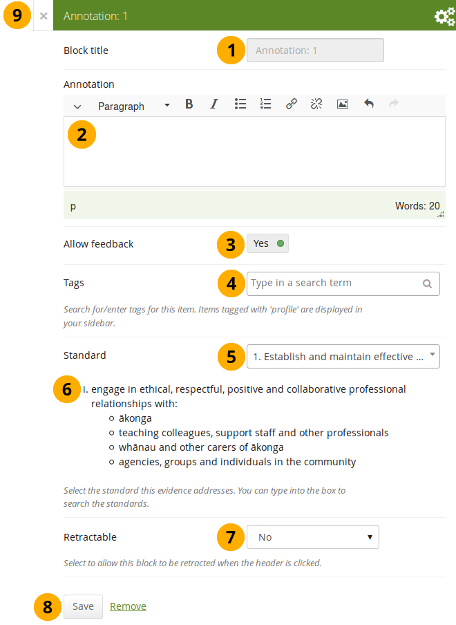
Configure the Annotation block
-
Block title: The block title is set automatically based on the standard selected. It takes the form of “Annotation: Shortname of the standard” and cannot be changed.
-
Annotation: Write your annotation for your portfolio page. The annotation helps connect the evidence on the page to the standard or competency you selected to associate it with in the competency framework.
You can change the text as long as no feedback has been placed on the block. In order to change the text, you go into Edit mode of the page and then choose the Configure icon of the Annotation block that you want to change. You cannot change the annotation from the SmartEvidence map.
-
Allow feedback: When you allow feedback on your annotation, others can leave feedback as usual. However, as soon as the first feedback has been added, you will not be able to make changes to your annotation text anymore. That is to ensure that the feedback still relates back to the annotation.
-
Tags: Enter tags to find your annotation more easily at a later stage. Separate your tags with commas. If you already have tags, you can click on the link Show my tags and select the ones that you think will fit for this collection as well. They will be entered into the text field for you.
-
Standard: When you place the Annotation block on the page, you can select the standard with which the page shall be associated based on the SmartEvidence framework selected for the collection. You can change the standard until somebody leaves feedback or makes an assessment. If you select the page from the SmartEvidence overview page, the standard is pre-selected and cannot be changed.
You can use the Annotation block without SmartEvidence, but then you can’t choose a competency standard.
-
The description of the selected standard is displayed so you can easily reference it.
-
Retractable: Choose whether you want to allow users to reduce the block to its heading on a page or see just the heading only automatically. The options are:
- No: The block and its content is displayed at all times.
- Yes: Allow users to reduce the block to just the heading by clicking the Retractable icon .
- Automatically retract: Only the heading of the block is visible, and the user can click the Retracted icon to view its content.
-
Click the Save button to accept your changes, or click Cancel to leave the block’s content as it is. Remove is shown only when you place the block into the page for the first time.
-
You can also click the Close button in the top left-hand corner of the modal window to either remove a newly created block before it is being saved or to cancel any changes and leave the block’s content as it is.
Respond to an annotation on the SmartEvidence map
When you have access to a collection that contains a SmartEvidence map, you can leave feedback on an annotation. You may be able to assess it if you have staff or institution administrator permissions in the same institution as the portfolio author unless it is a self-assessment framework.
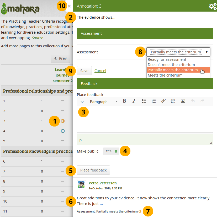
Respond to an annotation
-
Click the annotation on the SmartEvidence map that you wish to take a closer look at. A modal window opens with the annotation.
-
Read the annotation.
-
Place feedback: You can leave feedback on the annotation.
-
Make public: Decide whether everybody who has access to the page can view your feedback or just the portfolio author.
-
Click the Place feedback button to add your feedback to the annotation.
-
You can view the feedback of others.
-
If an assessment was already made, you can see it here. This also serves as log of the assessment changes throughout the lifetime of the annotation.
-
Assessment: If you have the permission to assess the standard, you see a drop-down menu here with the possible statuses that you can use. Select one of them.
The assessment statuses are defined in the SmartEvidence framework file.
-
Click the Save button to keep your selection or click Cancel to abort the assessment.
-
You can also click the Close button in the top left-hand corner of the modal window to either remove a newly created block before it is being saved or to cancel any changes and leave the block’s content as it is.
Respond to an annotation on a page
You can provide feedback to an annotation, and assess it if you have the appropriate permission, also from the portfolio page on which the annotation is placed.
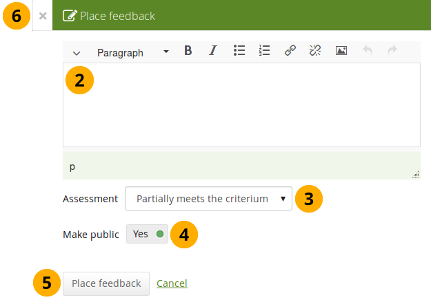
Respond to an annotation on a page
-
Click the Place feedback link at the bottom of the Annotation block.
-
Write your feedback.
-
Assessment: If you have the permission to assess the standard, you see a drop-down menu with the possible statuses that you can use. Select one of them.
The assessment statuses are defined in the SmartEvidence framework file.
-
Make public: Decide whether everybody who has access to the page can view your feedback or just the portfolio author.
-
Click the Place feedback button to add your feedback to the annotation or click Cancel to abort the assessment.
-
You can also click the Close button in the top left-hand corner of the modal window to either remove a newly created block before it is being saved or to cancel any changes and leave the block’s content as it is.
Delete an annotation
When you delete an annotation, all its feedback is deleted as well. You cannot retrieve it again easily.
Comments
You can move the comments section from the bottom of a page elsewhere onto your page to integrate it better with your page content. Please note the following:
- There is no configuration possible for this block.
- You only see comments when you display a page, but not in edit mode.
- You can only place 1 comment block onto a page.
- Comments for individual artefacts is still placed at the bottom of the artefact details pages because you cannot put a block onto these pages.
- You can move the block like any other block on your page. If you delete the block, the comments are displayed at the bottom of the page again.
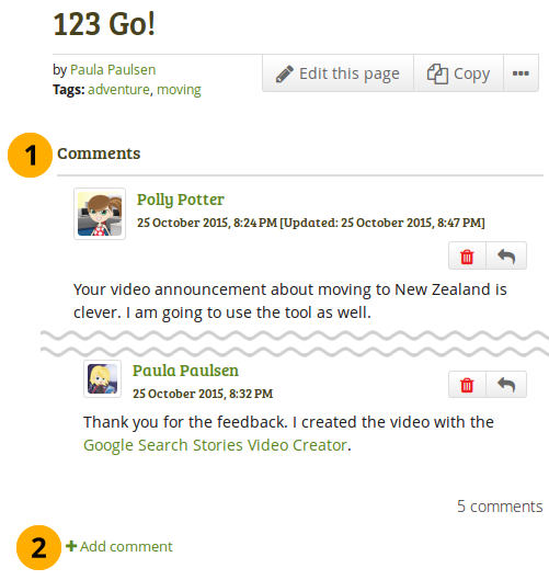
What the feedback block looks like on a page
- The block has the heading “Comments” unless your Mahara installation uses a different word.
- When you click the Add comment link, a modal window is displayed in which you can enter your comments with all the usual functionality.
Creative Commons license
Add a block to your page which lets users know under which Creative Commons license your page is published.
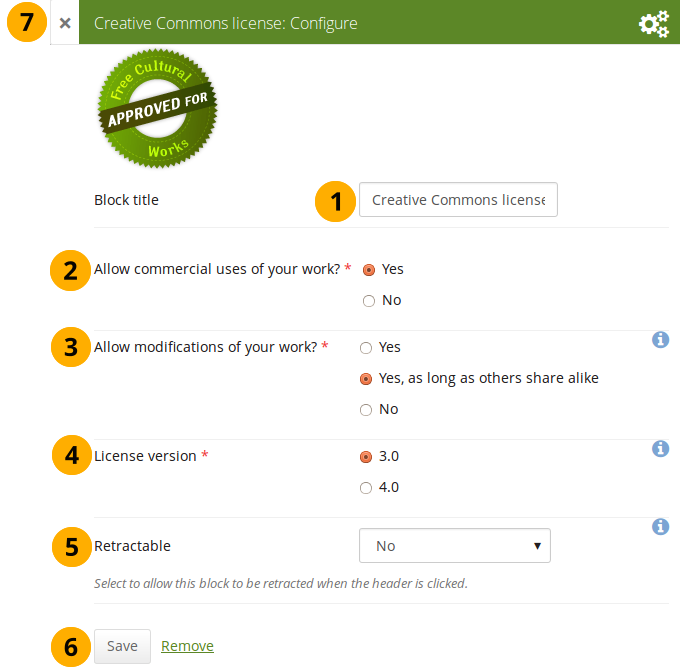
Configure the Creative Commons license block
-
Block title: Choose a title for your block.
-
Allow commercial uses of your work? Decide whether users can re-use your work for commercial purposes.
-
Allow modifications of your work? Decide whether others can remix your work and create something new and if so under which conditions.
-
License version: Select under which Creative Commons license you wish to publish your work. You can choose between
- Creative Commons 3.0
- Creative Commons 4.0
Check out what is new in Creative Commons 4.0, and why you may want to choose that license.
-
Retractable: Choose whether you want to allow users to reduce the block to its heading on a page or see just the heading only automatically. The options are:
- No: The block and its content is displayed at all times.
- Yes: Allow users to reduce the block to just the heading by clicking the Retractable icon .
- Automatically retract: Only the heading of the block is visible, and the user can click the Retracted icon to view its content.
-
Click the Save button to accept your changes, or click Cancel to leave the block’s content as it is. Remove is shown only when you place the block into the page for the first time.
-
You can also click the Close button in the top left-hand corner of the modal window to either remove a newly created block before it is being saved or to cancel any changes and leave the block’s content as it is.
Group info
This block is a default block on the group homepage. There is no configuration possible.
This block can only be used on a group homepage.
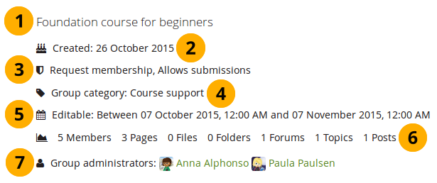
Items in the group info block
The block contains information about:
- Description of the group
- Group creation date
- Type of group
- Group category if any was chosen
- Dates between which regular group members can participate in group activities. This information is only visible if any dates were entered in the group settings.
- Group statistics
- number of group members
- number of pages created in the group
- number of files uploaded to the group
- number of folders created in the group
- number of forums created in the group
- number of forum topics created in the group
- number of posts in forum topics in the group
- Group administrators
Group members
This block is a default block on the group homepage. You can display member profile pictures and their names.
This block can only be used on a group homepage.
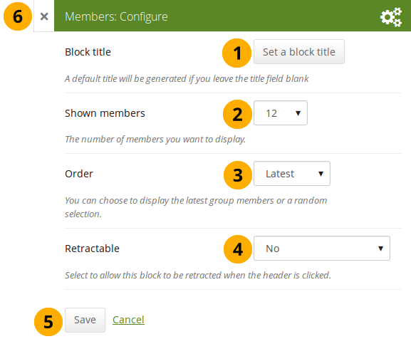
Configure the Group members block
- Block title: The automatic title for this block is “Members”. You can set another one if you wish.
- Shown members: Choose how many members (between 1 and 100) are shown on the group homepage. All others are accessible via the Members tab in the group. The default number of members displayed is 12.
- Order: Choose the order in which members are displayed. Options are
- Latest: Display members according to their group joining date in reverse chronological order.
- Random: Let Mahara decide which members to display.
- Retractable: Choose whether you want to allow users to reduce the block to its heading on a page or see just the heading only automatically. The options are:
- No: The block and its content is displayed at all times.
- Yes: Allow users to reduce the block to just the heading by clicking the Retractable icon .
- Automatically retract: Only the heading of the block is visible, and the user can click the Retracted icon to view its content.
- Click the Save button to accept your changes, or click Cancel to leave the block’s content as it is. Remove is shown only when you place the block into the page for the first time.
- You can also click the Close button in the top left-hand corner of the modal window to either remove a newly created block before it is being saved or to cancel any changes and leave the block’s content as it is.
Group portfolios
This block is a default block on the group homepage. You can display pages and collections created in and / or shared with the group in this block.
This block can only be used on a group homepage.
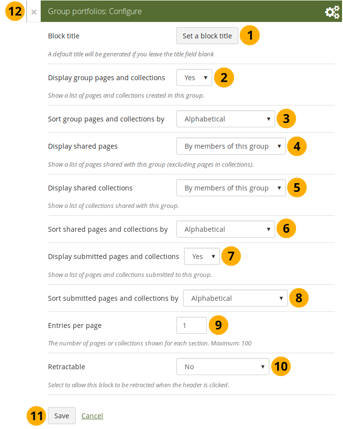
Configure the Group portfolios block
-
Block title: The automatic title for this block is “Group portfolios”. You can set another one if you wish.
-
Display group pages and collections: Decide whether to display pages and collections that were created in the group. “Yes” is the default option.
-
Sort group pages and collections by: Choose in which order to display portfolios created in the group. “Alphabetical” is the default option, but you can also display them based on when they were last updated.
-
Display shared pages: Decide whether to display pages that users shared with the group. Pages that are in collections are not displayed. The options are:
-
None: No shared pages are displayed.
-
By members of this group: Display only pages that have been shared by members of the group.
This option is particularly well-suited for groups that are used for class purposes. That way, students can share their pages or collections with the group for a long time, but the administrator can choose to display only pages of group members but not those that are not members anymore. The pages of non-group members are still accessible via the Shared with me functionality.
-
By anybody: Display all pages that have been shared with the group.
-
-
Display shared collections: Decide whether to display collections that users shared with the group. The options are:
- None: No shared collections are displayed.
- By members of this group: Display only collections that have been shared by members of the group.
- By anybody: Display all collections that have been shared with the group.
Submitted pages are not displayed in the section of “Shared pages” and “Shared collections” to avoid confusion whether they have been shared with the group or not.
-
Sort shared pages and collections by: Choose in which order to display pages and collections shared with the group. “Alphabetical” is the default option, but you can also display them based on when they were last updated.
-
Display submitted pages and collections: Decide whether to display pages and collections that group members submitted to the group. There is no distinction made between pages and collections. “Yes” is the default option.
When you choose this option, you also see which members have not yet submitted a portfolio to the group. This is helpful in particular in large groups with lots of portfolio submissions.
-
Sort submitted pages and collections by: Choose in which order to display pages and collections submitted to the group. “Alphabetical” is the default option, but you can also display them based on when they were last updated.
-
Entries per page: Choose the maximum number of pages or collections you wish to see on the group homepage for the above before a paginator is displayed. You can display a maximum of 100 items per category.
-
Retractable: Choose whether you want to allow users to reduce the block to its heading on a page or see just the heading only automatically. The options are:
- No: The block and its content is displayed at all times.
- Yes: Allow users to reduce the block to just the heading by clicking the Retractable icon .
- Automatically retract: Only the heading of the block is visible, and the user can click the Retracted icon to view its content.
-
Click the Save button to accept your changes, or click Cancel to leave the block’s content as it is. Remove is shown only when you place the block into the page for the first time.
-
You can also click the Close button in the top left-hand corner of the modal window to either remove a newly created block before it is being saved or to cancel any changes and leave the block’s content as it is.
A page is considered as modified when the content of at least one block is updated, including the adding of a new Mahara journal entry into the journal block.
Inbox
The Inbox block displays the latest messages that you have received.
This block can only be used on your dashboard.
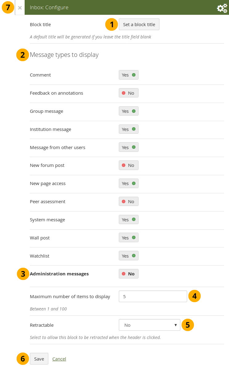
Configure the Inbox block
- Block title: The automatic title for this block is “Inbox”. You can set another one if you wish.
- Message types to display: Change the switch to “Yes” for each message type that you want to display in this block.
- Administration messages: If you are an institution or site administrator, you see this option. All administration messages such as for objectionable content, virus upload, contact, etc. are grouped in “Administration messages”.
- Maximum number of items to display: Decide how many messages shall be shown on your dashboard. You can choose between 1 and 100.
- Retractable: Choose whether you want to allow users to reduce the block to its heading on a page or see just the heading only automatically. The options are:
- No: The block and its content is displayed at all times.
- Yes: Allow users to reduce the block to just the heading by clicking the Retractable icon .
- Automatically retract: Only the heading of the block is visible, and the user can click the Retracted icon to view its content.
- Click the Save button to accept your changes, or click Cancel to leave the block’s content as it is. Remove is shown only when you place the block into the page for the first time.
- You can also click the Close button in the top left-hand corner of the modal window to either remove a newly created block before it is being saved or to cancel any changes and leave the block’s content as it is.
When you display messages from other users on your dashboard through the Inbox block, you can see quickly which messages you have not read. They are marked in bold.
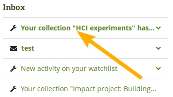
Unread messages are displayed in bold
Latest changes I can view
The Latest changes I can view block displays the latest portfolios to which you have access across Mahara by other people. This includes pages and collections. Prior to Mahara 15.10 this block was called Latest pages.
This block can only be used on your dashboard.
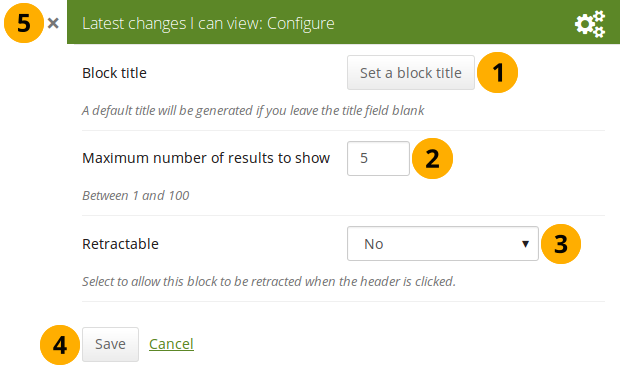
Configure the Latest changes I can view block
- Block title: The automatic title for this block is “Latest changes I can view”. You can set another one if you wish.
- Maximum number of results to show: Decide how many pages and collections shall be shown on your dashboard. You can choose between 1 and 100.
- Retractable: Choose whether you want to allow users to reduce the block to its heading on a page or see just the heading without the block content automatically. The options are:
- No: The block and its content is displayed at all times.
- Yes: Allow users to reduce the block to just the heading by clicking on the heading of a block where the Retractable icon is shown.
- Automatically retract: Only the heading of the block is visible, and the user can click on the heading of a block where the Retracted icon is shown to view its content.
- Click the Save button to accept your changes, or click the Cancel button to leave the block’s content as it is. The Remove button is shown only when you place the block into the page for the first time.
- You can also click the Close icon in the top left-hand corner to either remove a newly created block before it is being saved or to cancel any changes and leave the block’s content as it is.
The block on your dashboard page looks like the following.
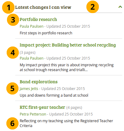
Example of the Latest changes I can view block
- Title of the block.
- If you chose a retractable option, you can click on the title or anywhere in the title space to change the block’s behaviour.
- Title of the page or collection to which you have access.
- If it is a collection, you see the number of pages contained within.
- Name of the portfolio author, and when the portfolio was last updated.
- Page or collection description.
Navigation
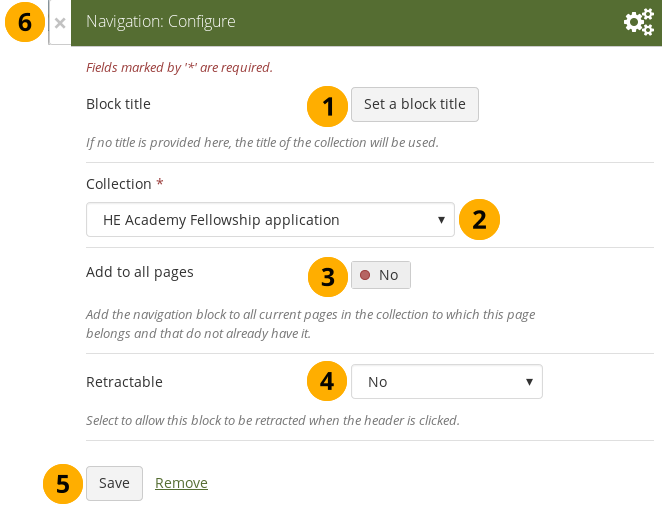
You must create at least one collection in order to use this block.
-
Block title: The title of the collection is chosen automatically unless you provide a different one.
-
Collection: Choose the collection from the drop-down menu for which you wish to display links in the block.
-
Add to all pages: Automatically add the block to all pages in the current collection with links to the selected collection.
If you add another page to the collection, it does not automatically receive the navigation block. You need to add it manually.
-
Retractable: Choose whether you want to allow users to reduce the block to its heading on a page or see just the heading only automatically. The options are:
- No: The block and its content is displayed at all times.
- Yes: Allow users to reduce the block to just the heading by clicking the Retractable icon .
- Automatically retract: Only the heading of the block is visible, and the user can click the Retracted icon to view its content.
-
Click the Save button to accept your changes, or click Cancel to leave the block’s content as it is. Remove is shown only when you place the block into the page for the first time.
-
You can also click the Close button in the top left-hand corner of the modal window to either remove a newly created block before it is being saved or to cancel any changes and leave the block’s content as it is.
Note
Add a note to your page. This feature is used when you do not want to keep the text in a journal, but still want to be able to re-use the text on other pages.
Add a new note
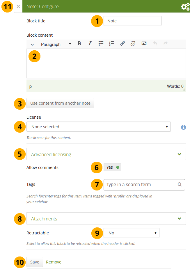
Configure the Note block
-
Block title: Provide a title for your note.
-
Block content: Write your text. You can include formatting, external images etc.
-
Alternatively, you can also use text from another note that you have already written. Click the Use content from another note button to do so.
-
License: You see this drop-down menu if the site administrator turned on license metadata. Additionally, if you are in an institution, your institution administrator may require you to provide a license. Your default license is displayed. You can set your default license in your account settings. You may choose a different license for each individual artefact.
-
Advanced licensing: If you can / must enter license information, you can also provide information about the original licensor and a URL where the original can be found.
-
Allow comments: Switch this setting to “No” if you do not want others to comment on your note. This option is set to “Yes” by default.
-
Tags: Enter tags to find your note more easily at a later stage. You can choose from your existing tags by starting to type a letter and then selecting the tag you want to use. You can also type a new tag, and it is added to your list of tags.
You can find more information on how to use the tag selector in the “Tags” section.
-
Attachments: Attach a file to a note as additional evidence for the text you are writing.
-
Retractable: Choose whether you want to allow users to reduce the block to its heading on a page or see just the heading only automatically. The options are:
- No: The block and its content is displayed at all times.
- Yes: Allow users to reduce the block to just the heading by clicking the Retractable icon .
- Automatically retract: Only the heading of the block is visible, and the user can click the Retracted icon to view its content.
-
Click the Save button to accept your changes, or click Cancel to leave the block’s content as it is. Remove is shown only when you place the block into the page for the first time.
-
You can also click the Close button in the top left-hand corner of the modal window to either remove a newly created block before it is being saved or to cancel any changes and leave the block’s content as it is.
Add an image into a note
Please refer to the section “Insert an image into text” for more information.
Attach a file to a note
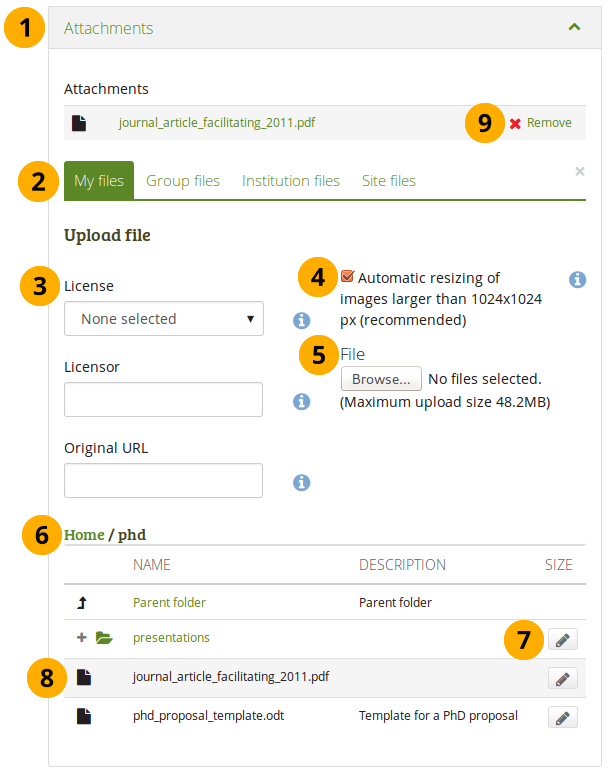
Attach a file to a Note block
-
Click the Attachments panel if you wish to add one or more files to a note.
-
Files area: Choose from which files area you would like to select a file:
- My files: You see all the folders and files that you have created.
- Group files: You see all the folders and files that you are allowed to publish.
- Institution files: If you are an institution administrator, you will see institution folders and files.
- Site files: If you are a site administrator, you will see all site folders and files. Otherwise, you can only see the ones that are in the folder public in the Site files.
-
License information: You see these fields if the site administrator turned on license metadata. Additionally, if you are in an institution, your institution administrator may require you to provide a license.
- License: Your default license is displayed. You can set your default license in your account settings. You may choose a different license for each individual artefact.
- Licensor: If you are uploading a file that somebody else created, you can attribute the work to them here and provide their name for example.
- Original URL: If you are uploading somebody else’s file, provide a link to the original Internet address so that others can go there and view the original file.
-
If the site administrator turned on the image resizing option, you can decide whether you want to have your images resized if they are larger than the specified dimensions. This option is recommended to save space in your portfolio.
-
File: You do not have to go back to your Files area in Create in order to upload a file. You can do so directly from this screen.
-
Folder path: The breadcrumbs show in which folder you are currently.
-
Click the Edit button to change any component of a folder or file, i.e. its name, description and tags. If you have a folder or file included in a page that you submitted for feedback, you will not be able to edit them.
You can also still select files that have been submitted in another portfolio page.
-
Click into the row that contains the file you wish to display in the block to select it.
When you place group, institution or site files into a page, beware that these files may not be available at some point anymore when the person in charge deletes them.
-
Click Remove if you want to revert your selection.
-
Continue editing your note and save it.
Re-use text from an existing note
You can re-use text from other note from one page in another without having to copy the page first.
If you do not make a copy of the note content in the block configuration and change it, the text is changed in all other instances where this note is used.
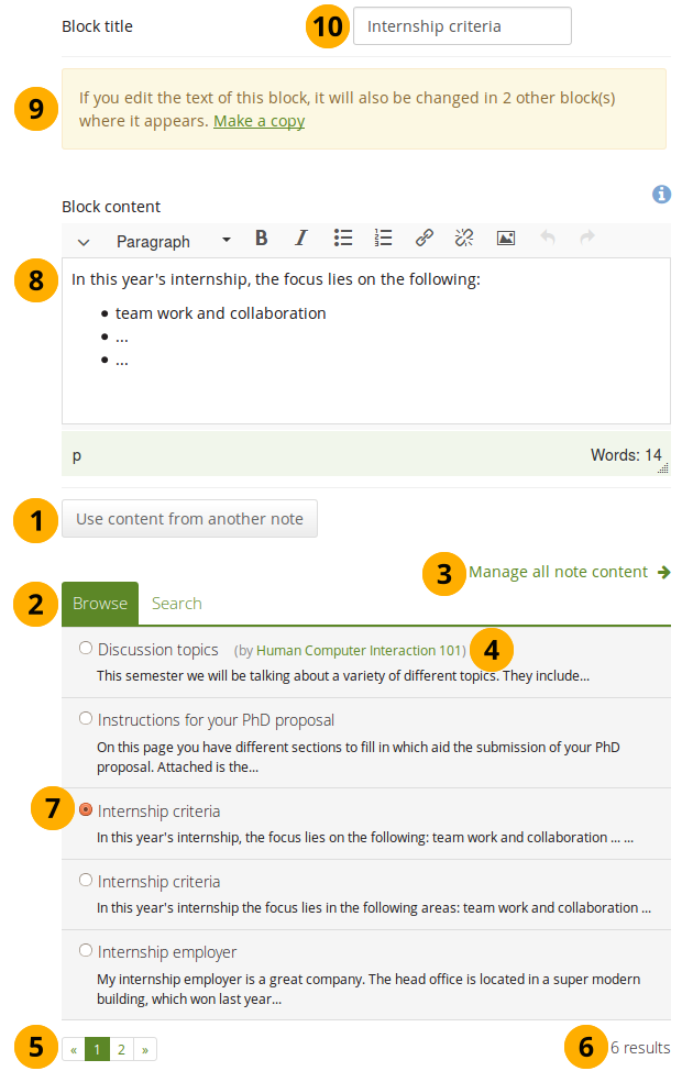
Configure the Note block by copying text
Open a note that is submitted for assessment in another portfolio
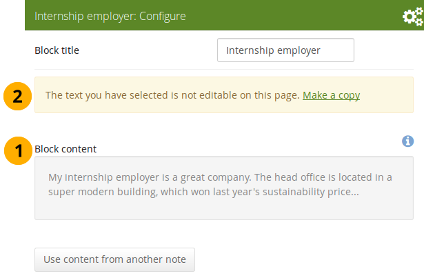
- Block content: When you open a note that is used on a page that is currently submitted, you cannot make changes to the note.
- Click the Make a copy link in order to make changes to this note on this page only. It is not changed on the other page that is submitted or on any other page where the text appears.
Peer assessment
Allow peer reviewers to give blind feedback.
Add the peer assessment block to a page
This block allows somebody else to provide blind feedback on the portfolio author, e.g. in a formal assessment context where skills and competencies need to be assessed by the peer independently of what the portfolio author has stated.
The peer reviewer can see block headings, but not the content in the blocks themselves. If the portfolio consists of multiple pages, and one of them does not contain a peer block, the peer reviewer does not see the page content at all.
You must give a person the “Peer” role when sharing the portfolio page for them to be able to add their assessment.
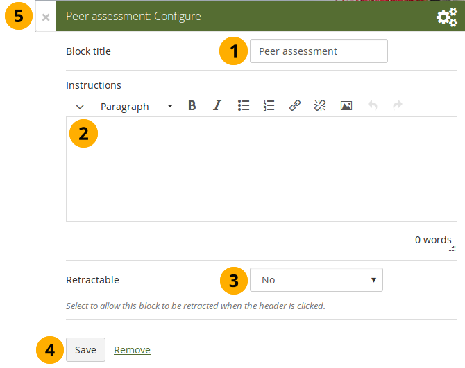
Configure the Peer assessment block
- Block title: The title that you want to give this particular block.
- Instructions: Provide instructions for the peer reviewer to help them with their assessment.
- Retractable: Choose whether you want to allow users to reduce the block to its heading on a page or see just the heading only automatically. The options are:
- No: The block and its content is displayed at all times.
- Yes: Allow users to reduce the block to just the heading by clicking the Retractable icon .
- Automatically retract: Only the heading of the block is visible, and the user can click the Retracted icon to view its content.
- Click the Save button to accept your changes, or click Cancel to leave the block’s content as it is. Remove is shown only when you place the block into the page for the first time.
- You can also click the Close button in the top left-hand corner of the modal window to either remove a newly created block before it is being saved or to cancel any changes and leave the block’s content as it is.
Set up a peer assessor
You can give someone the peer assessment permissions on the Edit access screen of your portfolio page.
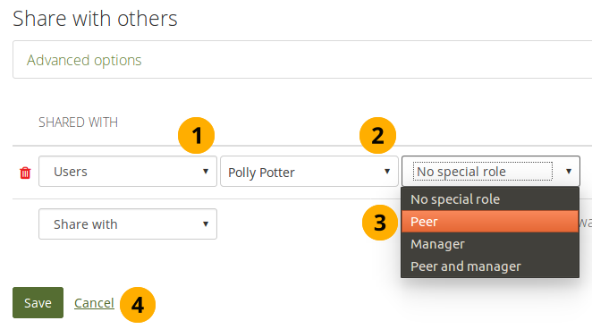
Give someone peer assessment permissions
If the page is in a collection that contains pages that don’t have the peer assessment block, the peer assessor doesn’t see any content on those pages but the notice “You cannot see the content on this page because it does not require a peer assessment.”
Add a peer assessment
Peer assessments are blind assessments at the moment allowing the peer assessor to give their feedback independently of the portfolio author.

Add a peer assessment
When you are the peer assessor on someone’s portfolio, and a page contains a peer assessment block, you can add your assessment by clicking the Add peer assessment link.
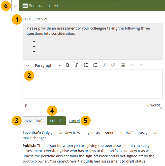
Write a peer assessment
-
Click the Instructions link to view the instructions for the peer assessment.
-
Write your peer assessment.
-
Click the Save draft button if you are not yet ready for the portfolio author to view your assessment, and you want to save a draft status.
-
Click the Publish button when you finished your assessment, and the portfolio author can view it. A notification is also sent to the portfolio author.
If the peer assessment block is used in conjunction with the sign-off block, the portfolio author must sign off the page before anybody other than themselves and the peer assessor can see published peer assessments.
View a peer assessment
If a peer assessment is in draft mode, only the peer assessor can see it. Once it’s published, others can view it as well.
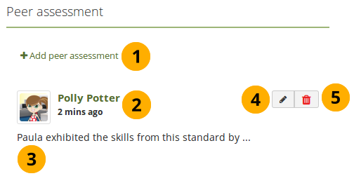
View a peer assessment
- Click the Add peer assessment link if you want to add (another) peer assessment when you cannot edit an earlier one in the same block anymore.
- The profile picture and name of the peer assessor are displayed along with the date and time when the peer assessment was made.
- The peer assessment is displayed.
- The Edit button is only displayed to the peer assessor for 10 minutes after publishing the assessment in case there are last minute changes they want to make.
- The Delete button is only shown to the peer assessor, and they can delete their assessment at any point. If they do, the portfolio author receives an email about that with the text of the assessment included.
Plans
Display your plans in a block.
You must create at least one plan in order to use this block.
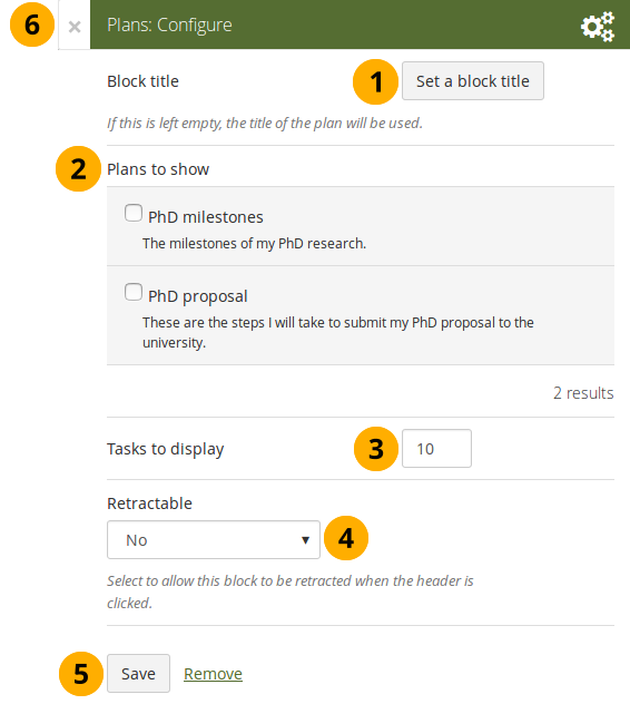
Configure the Plans block
- Block title: The title of the plan is chosen automatically unless you provide a different one.
- Plans to show: Choose the plan or plans which you want to display in your page.
- Tasks to display: Decide how many tasks you want to display for each plan before a paginator is displayed.
- Retractable: Choose whether you want to allow users to reduce the block to its heading on a page or see just the heading only automatically. The options are:
- No: The block and its content is displayed at all times.
- Yes: Allow users to reduce the block to just the heading by clicking the Retractable icon .
- Automatically retract: Only the heading of the block is visible, and the user can click the Retracted icon to view its content.
- Click the Save button to accept your changes, or click Cancel to leave the block’s content as it is. Remove is shown only when you place the block into the page for the first time.
- You can also click the Close button in the top left-hand corner of the modal window to either remove a newly created block before it is being saved or to cancel any changes and leave the block’s content as it is.
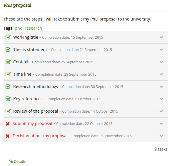
Result of an embedded plan in a portfolio page. By clicking on the linked titles, you can show the descriptions of the individual tasks.
Recent forum posts
Display a specified number of recent forum posts from one group on a page.
You must be a member of at least one group in order to use this block.
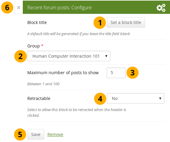
Configure the Recent forum posts block
- Block title: The title of the block is generated automatically unless you provide a different one. The default title is “Recent forum posts”.
- Group: Choose the group whose forum posts you wish to display.
- Maximum number of posts to show: Decide how many of the latest forum posts you wish to show. The default value is 5. You can show up to 100 posts.
- Retractable: Choose whether you want to allow users to reduce the block to its heading on a page or see just the heading only automatically. The options are:
- No: The block and its content is displayed at all times.
- Yes: Allow users to reduce the block to just the heading by clicking the Retractable icon .
- Automatically retract: Only the heading of the block is visible, and the user can click the Retracted icon to view its content.
- Click the Save button to accept your changes, or click Cancel to leave the block’s content as it is. Remove is shown only when you place the block into the page for the first time.
- You can also click the Close button in the top left-hand corner of the modal window to either remove a newly created block before it is being saved or to cancel any changes and leave the block’s content as it is.
Sign-off
The sign-off and verification process allows for a visual indicator on a portfolio page showing whether the page has been finished and whether a manager has verified it before it can go for the final assessment. The verification by a manager is optional.
Set up a page for sign-off and verification
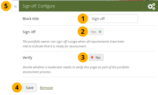
Configure the Sign-off block
-
Block title: Give the block a title. This is not required as the options will sit right below the page heading rather than in a block on the page itself when in view mode.
-
Sign off: A sign-off by the portfolo author is always required.
-
Verify: Give a person with the “Manager” permission the opportunity to verify a page and state that fact to carry it one step further in the assessment. Page content will not be locked when the verification has been made.
The manager cannot revoke the verification. This can only be done by the portfolio author in form of revoking the sign-off for the page.
Set up a manager for verification
You can give someone the manager permissions on the Edit access screen of your portfolio page to allow them to verify your portfolio.
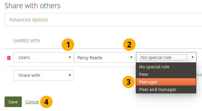
Give someone manager permissions
Sign off a page
When you have a sign-off block on your page and you view it, you can see the sign-off and verification options below the page heading to the right.

View the sign-off as portfolio autor
When you are ready to sign off your page, you can click the red dot icon , and it will turn into a green tick icon to indicate that the page has been signed off.
If the page also needs a verification, your manager can now perform it.
Verify a page
As manager, you can see the sign-off and verification options below the page heading to the right. You can only tick the verification option.

Verify a page as manager
When you are ready to verify a page that allows for verification, you can click the red dot icon , and it will turn into a green tick icon to indicate that the page has been verified.
You cannot revoke the verification. Only the portfolio author can do so by revoking the sign-off.
Text
Add text to your page. This feature is used when you want to put a snippet of text onto a page that does not have to be re-used.
In a default Mahara instance, this block is available in the content chooser at the top together with the Image block. It does not appear in the section General as well.
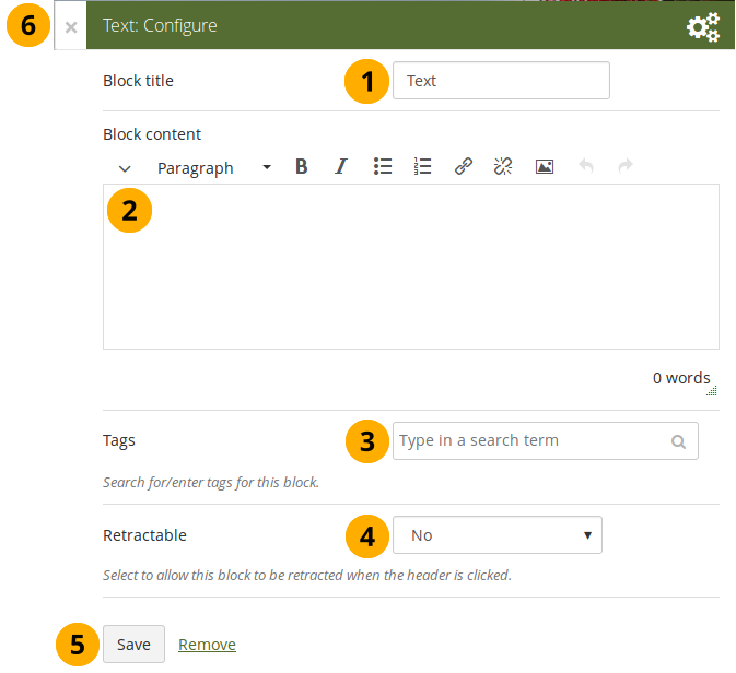
Configure the Text block
- Block title: Provide a title for your text.
- Block content: Write your text. You can include formatting, external images etc.
- Tags: Enter tags for this block to find this content more easily. The tags are displayed as part of the page tags.
- Retractable: Choose whether you want to allow users to reduce the block to its heading on a page or see just the heading only automatically. The options are:
- No: The block and its content is displayed at all times.
- Yes: Allow users to reduce the block to just the heading by clicking the Retractable icon .
- Automatically retract: Only the heading of the block is visible, and the user can click the Retracted icon to view its content.
- Click the Save button to accept your changes, or click Cancel to leave the block’s content as it is. Remove is shown only when you place the block into the page for the first time.
- You can also click the Close button in the top left-hand corner of the modal window to either remove a newly created block before it is being saved or to cancel any changes and leave the block’s content as it is.
Please refer to the section “Insert an image into text” for more information on adding an image to the text block.
Watched pages
The Watched pages block displays the pages that are either on your watchlist or belong to your friends and you have access to them.
You can only use this block on your dashboard.
Pages on my watchlist
If you want pages to be displayed, you need to add them to it first by clicking the More options button on a page and then add the page to your watchlist.
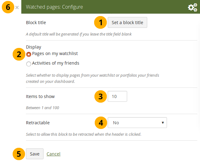
Configure the Watched pages block for your watchlist
- Block title: The automatic title for this block is “Watched pages”. You can set another one if you wish.
- Select to display Pages on my watchlist.
- Items to show: Decide how many pages shall be shown on your dashboard. You can choose between 1 and 100.
- Retractable: Choose whether you want to allow users to reduce the block to its heading on a page or see just the heading without the block content automatically. The options are:
- No: The block and its content is displayed at all times.
- Yes: Allow users to reduce the block to just the heading by clicking the Retractable icon .
- Automatically retract: Only the heading of the block is visible, and the user can click the Retracted icon to view its content.
- Click the Save button to accept your changes, or click the Cancel button to leave the block’s content as it is. The Remove button is shown only when you place the block into the page for the first time.
- You can also click the Close button in the top right-hand corner to either remove a newly created block before it is being saved or to cancel any changes and leave the block’s content as it is.
View your watchlist on your dashboard.
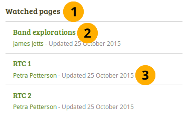
View the Watched pages block
-
Title of the block.
If you chose a retractable option, you can click on the title or anywhere in the title space to change the block’s behaviour.
-
Title of the watched page. You can click the link to be taken to her.
-
View the page owner and the date when the page was last updated. This is in particular important information when all your watched pages have the same or a similar title.
Activities of my friends
If you have friends on Mahara, then you can use this block to display their portfolios when they have shared them with you:
- personally
- as a member of a group
- as an institution member
- as a registered user
- publicly
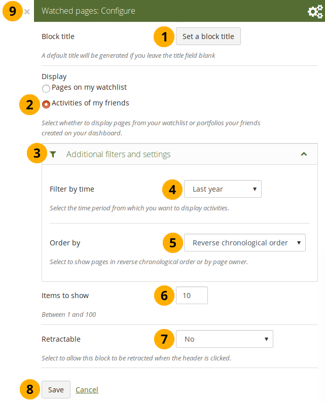
Configure the Watched pages block for your friend activity
- Block title: The automatic title for this block is “Watched pages”. You can set another one if you wish.
- Select to display Activities of my friends.
- Click Additional filters and settings to make additional changes.
- Filter by time: You can select the time period over which you want to see changes. Your options are:
- Last week
- Last month
- Last 2 months
- Last 3 months
- Last 6 months
- Last year
- Since last login
- Order by: Decide how the portfolios are to be ordered. Your choices are:
- Reverse chronological order: Display the latest changes first
- Page owner: Display all pages by their owner with the one having made changes last first.
- Items to show: Decide how many pages shall be shown on your dashboard. You can choose between 1 and 100.
- Retractable: Choose whether you want to allow users to reduce the block to its heading on a page or see just the heading without the block content automatically. The options are:
- No: The block and its content is displayed at all times.
- Yes: Allow users to reduce the block to just the heading by clicking the Retractable icon .
- Automatically retract: Only the heading of the block is visible, and the user can click the Retracted icon to view its content.
- Click the Save button to accept your changes, or click the Cancel button to leave the block’s content as it is. The Remove button is shown only when you place the block into the page for the first time.
- You can also click the Close button in the top right-hand corner to either remove a newly created block before it is being saved or to cancel any changes and leave the block’s content as it is.

No Comments